Memphis design, postmodern revival.
The 1981 Milan-born postmodern movement founded by Ettore Sottsass — geometric pattern collisions, primary colours and pastels, squiggles and zigzags, anti-modernist whimsy. A style guide for kids brands, indie fashion, music festivals, and Gen-Z direct-to-consumer.
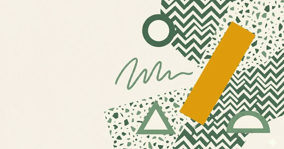
- Memphis design = the 1981 Milan postmodern movement founded by Ettore Sottsass; geometric pattern collisions, primary colours and pastels, squiggles, zigzags, dots, anti-modernist whimsy.
- Revived in web design from around 2017 onwards as kids brands and indie fashion sought to break out of the muted DTC palette dominating the late 2010s.
- Palette is hot pink, electric blue, chartreuse yellow, terracotta, mint, postmodern black, pure white. Type pairs Recoleta or Pally display with DM Sans body and a mono utility face.
- Right for kids brands, indie fashion, music festivals, ice-cream and dessert ecommerce, Gen-Z direct-to-consumer. Wrong for enterprise B2B, healthcare, finance, accessibility-critical pages, and checkout flows.
- High-saturation colour collisions are a near-guaranteed WCAG 2.1 AA contrast failure if applied to body text; reserve the loud pairings for decorative blocks and keep reading-zone text on calm neutrals.
The 1981 Milan postmodern movement.
Memphis design is the postmodern movement founded in Milan in 1981 by Italian architect Ettore Sottsass together with a collective of designers operating under the name Memphis. The visual language is a deliberate rejection of cold corporate Italian modernism: geometric shape collisions without grids, primary colours dropped next to pastels, squiggles, zigzags, dots, scattered confetti, and hand-cut chunky surfaces in place of slick polished ones. The group disbanded formally in 1988, but the aesthetic has cycled through every decade of design since — furniture, fashion, graphics, packaging, and from 2017 onwards, web design.
The web revival accelerated as kids brands, indie fashion labels, and Gen-Z direct-to-consumer ecommerce looked for an exit from the muted neutral palette that dominated late-2010s interface design. Where most DTC sites of the period leaned beige, sage, terracotta, and oat, a Memphis-influenced storefront looked loud, hand-made, slightly off-kilter, and identifiably built for an audience under thirty. Brands like Magic Spoon, Olipop, Poppi, and Liquid Death cite the era directly in their visual languages, even when the final result reads more contemporary than 1981. The Memphis Group movement as a documented design history remains the canonical reference.
The aesthetic on the web is rarely a literal 1981 transplant. Modern Memphis-revival web design borrows three things from the original and softens the rest. First, the geometric shape collisions (triangle, circle, squiggle, zigzag) arranged with deliberate visual noise. Second, the high-saturation primary-meets-pastel palette. Third, the chunky cut-paper feel rather than the polished gradient look. What contemporary work usually drops is the most extreme pattern density of the original Memphis furniture and textiles, which would be unreadable on a small screen. The result is loud-but-legible: a calmer cousin of the 1981 source, calibrated for ecommerce conversion rather than gallery provocation.
Five reference points across four decades.
The fastest way to internalise Memphis design is to spend an hour with both the 1981 source material and the contemporary work that descends from it. The five references below cover the founder, the canonical documented archive, the commercial-product brand carrying the torch in the present, the editorial agency producing modern Memphis-revival commercial work, and the design-press archive that catalogues both eras.
- Ettore Sottsass — the founder. Twenty years at Olivetti as senior designer before launching Memphis at age sixty-four. His personal archive covers furniture, ceramics, jewellery, and graphic design across five decades. The Carlton bookshelf and the Casablanca sideboard remain the canonical Memphis furniture references.
- Memphis Group — the documented collective. Founded Milan, 11 December 1980 (first public showing 1981). Members included Michele De Lucchi, Aldo Cibic, Andrea Branzi, Matteo Thun, Martine Bedin, Nathalie Du Pasquier, and George Sowden. The Wikipedia entry is the most accessible single-page summary of the movement's chronology, members, and influence.
- Jonathan Adler — the contemporary Memphis-influenced product brand. American potter and product designer whose entire commercial catalogue carries the postmodern colour-and-geometry DNA into the present. The website itself is more refined than Memphis source material but the product photography and motif library are direct descendants.
- Pentagram — the editorial design agency producing Memphis-revival work in 2020s commercial contexts. Case studies under partners like Paula Scher and Eddie Opara repeatedly reference Memphis in fashion, food, and music client work. Worth browsing for proof that the style ports cleanly into 2026 brand identity.
- Designboom — the design-press archive. Long-running coverage of Memphis Group exhibitions, retrospectives, and contemporary descendants. Searching the archive for "Memphis Group" or "Sottsass" surfaces decades of editorial that traces the movement's revival cycles.
What all five share: refusal to read as muted, refusal to read as corporate, refusal to read as polished. Memphis is what is left after every commercial-modernist convention is rejected on purpose.
Seven colours, primary collisions encouraged.
Memphis palettes are deliberately maximal. Hot pink dropped next to electric blue. Chartreuse yellow shouting at a terracotta block. Mint pastel calming a hot accent. Postmodern black anchoring the composition. Pure white as the breathing room. The rule is not that every colour appears on every page; it is that no colour is desaturated or apologised for. A muted Memphis palette is not Memphis — it is just a soft modernist palette wearing borrowed clothes.
| swatch | name | hex | role |
|---|---|---|---|
| Hot pink | #ff5b9c | primary accent | |
| Electric blue | #1d4ed8 | secondary block | |
| Chartreuse yellow | #facc15 | highlight / squiggle | |
| Terracotta | #c2410c | grounding accent | |
| Mint | #6ee7b7 | pastel calm | |
| Postmodern black | #0f0f0f | ink / outline | |
| Pure white | #ffffff | paper / breathing room |
Notice the pairing logic: every primary has a pastel partner so the eye gets a rest. Hot pink with mint. Electric blue with chartreuse. Terracotta with white. A Memphis page that runs primary-on-primary at full saturation reads as a 1981 nightclub flyer; the modern version always lets one quiet pastel into the room.
Three faces. Chunky display, clean body, mono utility.
The typography pairing on a Memphis-revival page sets up the geometry before the geometry arrives. A chunky rounded display face for headlines reads as cut-paper and matches the shape vocabulary. A clean geometric sans for body keeps the reading zone calm so the eye does not fatigue. A mono face handles utility text (prices, captions, code) and adds a little 1980s technical signal. The pairing below is the modern Memphis stack used across most successful contemporary revival work.
| role | typeface | weight / style | source |
|---|---|---|---|
| display | Recoleta | Bold 700 / Black 900 | licensed / fontspring |
| display alternate | Pally | Bold 700 / Black 900 | licensed / fontshare |
| body | DM Sans | Regular 400 / Medium 500 | Google Fonts |
| body alternate | Inter | Regular 400 / Semibold 600 | Google Fonts |
| utility / captions | JetBrains Mono | Regular 400 | Google Fonts |
The rule is that the display face does the personality work and the body face does the reading work. A page that runs Recoleta or Pally for body type will tire the eye in three paragraphs. Keep the chunky display for headlines, callouts, and the occasional pull quote — nothing else.
When Memphis is the right call. And when it backfires.
Memphis design is a positioning move first and an aesthetic choice second. It works when the brand needs to read as playful, youthful, anti-corporate, or identity-forward — and it actively damages brands that need to read as serious, calm, or precise. Five archetypes where it fits, four where it does not.
Where Memphis works.
- Kids brands and toys — the visual language matches the audience cognitive register exactly. Big shapes, primary colours, no apology.
- Indie fashion and streetwear — the era signal is its own positioning statement. Memphis reads as anti-luxury, anti-fast-fashion, identity-forward.
- Gen-Z direct-to-consumer — cereal, beverages, supplements, snacks. The audience under thirty grew up with the revival and reads the palette as native.
- Music labels and festivals — pairs naturally with the bold-rhythm-led promotional design tradition. Coachella, Splendour, Glastonbury all use Memphis-adjacent material.
- Ice-cream and dessert brands — the palette already lives in the product. The website is a colour extension of the packaging.
- Stationery and toy-adjacent ecommerce — greeting cards, planners, kids art supplies. The geometry sells the product before the photo loads.
Where it actively damages the brand.
- Enterprise B2B — the visual noise reads as unserious. Buyers signing six-figure contracts want quiet competence, not party graphics.
- Healthcare and finance — both categories need to feel calm, precise, and trustworthy. The high-saturation palette signals the opposite. Wrong frequency.
- Accessibility-critical pages — the colour collisions hurt low-vision users. Hot pink on chartreuse fails WCAG 2.1 AA contrast. Government, education, and assistive-tech contexts: pick another style.
- Checkout and payment flows — the visual density raises cognitive load during the highest-stakes decision points. Conversion drops measurably. Memphis above the fold, visual quiet at checkout.
Accessibility audits will flag the colour-collision issue on day one. Plan for it: restrict the loud pairings to decorative blocks, keep all body text on a calm neutral background (cream or pure white), and run every text-over-colour pairing through a WCAG 2.1 contrast checker before shipping.
The honest test: if buyers need to trust the page, Memphis is the wrong tool. If they need to feel the brand is young, joyful, and anti-corporate, it is often the right one.
One copy-paste prompt for v0, Midjourney, or Claude.
The prompt below is tuned for image-generation models (Midjourney, Nano Banana Pro) and code-generation models (v0.dev, Claude Artifacts). It states the constraints Memphis design depends on — geometric shape collisions, postmodern primary-and-pastel palette, scattered confetti pattern, chunky cut-paper feel. Add the closing line "do not produce a slick polished DTC look, accept that the result should read as 1981 with a 2026 finish" to keep the output from drifting into generic illustrator-stock territory.
Paste the prompt into your tool of choice. The output will lean contemporary by default; if you want it closer to the 1981 source, add references to specific Memphis Group members (Sottsass, De Lucchi, Du Pasquier) in the brief. Most modern models recognise the names and will pull the source aesthetic forward.
Generate a Memphis-design-revival landing page for a [BRAND NAME / ONE-LINE
DESCRIPTION] in the [KIDS BRAND / INDIE FASHION / GEN-Z BEVERAGE / MUSIC
FESTIVAL / ICE-CREAM AND DESSERT] category.

PALETTE (strict, primary-and-pastel collisions encouraged):
- hero accent: hot pink #ff5b9c
- secondary block: electric blue #1d4ed8
- highlight squiggles and zigzags: chartreuse yellow #facc15
- grounding warm accent: terracotta #c2410c
- pastel calm partner: mint #6ee7b7
- ink for body type and chunky outlines: postmodern black #0f0f0f
- paper / breathing room (reading zones must stay on this): pure white #ffffff

TYPOGRAPHY:
- display: Recoleta Bold or Pally Bold, chunky rounded letterforms,
  no italic, sentence case for headlines
- body: DM Sans Regular 400, 16px minimum, 1.55 line-height
- utility text (prices, captions, badges): JetBrains Mono Regular

LAYOUT RULES (hard constraints):
- geometric shape collisions: triangle, circle, squiggle, zigzag,
  scattered dot confetti around the perimeter
- shapes overlap deliberately, no neat grid
- chunky cut-paper feel rather than slick gradient feel
- no drop-shadows softer than 4px hard offset (no glassmorphism, no blur)
- one primary-colour block bleeds off the canvas edge by 10-20% of viewport
- pastel partner (mint or terracotta) lives next to every primary block
  so the eye gets a rest
- buttons are chunky rectangles or pills with a 2-3px black border,
  hover state shifts background colour rather than animating
- body text always lives on pure white #ffffff, never on a colour block
- max two photographic images on the page, both with chunky black
  outlines or rounded corner radii of 24px+, no soft drop-shadows

DELIVERABLE: a single self-contained HTML file with inline CSS. No
JavaScript unless the user explicitly asks for an interaction.

Do not produce a slick polished DTC look. The result should read as
1981 with a 2026 finish: confident, slightly playful, chunky, loud,
and clearly built for an audience under thirty.
Models trained on 2023+ design data tend to default to muted soft-DTC palettes unless explicitly constrained. The strict palette block and the "1981 with a 2026 finish" closing line are what keep the output honest.
Five answers.
What is Memphis design in web layout?
Memphis design in a web context means borrowing the visual rules of the 1981 Memphis Group: geometric shapes colliding without a grid, primary colours next to pastels, squiggles and zigzags as decorative motifs, scattered dots and confetti patterns, and chunky cut-paper feels rather than slick polished surfaces. As a layout pattern, it rejects the muted neutral DTC look that dominated interface design from 2015 to 2022. Pages built in the style usually feel hand-cut, slightly off-kilter, and visually loud on purpose. The aesthetic is most often used today by kids brands, indie fashion labels, music festivals, ice-cream and dessert brands, and Gen-Z direct-to-consumer ecommerce.
Who founded the Memphis Group?
The Memphis Group was founded in Milan in 1981 by Italian architect and designer Ettore Sottsass, with a collective of designers including Michele De Lucchi, Aldo Cibic, Andrea Branzi, Matteo Thun, and several others. The name comes from the Bob Dylan song Stuck Inside of Mobile with the Memphis Blues Again, which was playing on repeat during the first meeting. Sottsass had been a senior designer at Olivetti for two decades before launching Memphis as a rebellion against the corporate Italian modernism he had helped define. The group disbanded formally in 1988, but their visual language has cycled through every decade of design since.
Is Memphis design good for ecommerce?
It depends on the audience. Memphis design is well suited to ecommerce in five categories: kids brands and toys, indie fashion and streetwear, music festivals and ticketing, ice-cream and dessert brands, and Gen-Z direct-to-consumer in any vertical where the buyer is under thirty and the product is an identity object rather than a commodity. It is a poor choice for checkout flows, healthcare ecommerce, financial services, or any context where the buyer needs to feel calm and reassured. The high-saturation pattern collisions add visual noise, which raises cognitive load during decision points like cart, shipping, and payment. The right pattern is Memphis above the fold, then visual quiet at checkout.
What fonts pair with Memphis design?
Three pairings work well. First, Recoleta or any chunky rounded display serif for headlines, paired with DM Sans for body, gives the contemporary indie-DTC look (used by Magic Spoon and similar brands). Second, Pally or Migra for display with Inter for body delivers a more editorial Memphis-revival feel suited to fashion and lifestyle. Third, for the most authentic 1981 reference, Letraset Faces of the era such as Plaza, Stop, or Block Up paired with Inter for body work but require careful licensing and accessibility care. Avoid pairing Memphis colour palettes with refined serifs like Garamond or Caslon, which fight the visual energy. The voice of the typography should match the voice of the geometry: confident, slightly playful, never timid.
Is Memphis design accessible?
Not by default. Three accessibility risks recur. First, the high-saturation primary palette frequently fails WCAG 2.1 AA contrast for body text. Hot pink on chartreuse is a signature Memphis pairing and a near-guaranteed contrast failure. Second, scattered geometric pattern backgrounds reduce legibility for readers with low vision, dyslexia, or attention-related processing differences. Third, the visual density itself increases cognitive load, which disadvantages users on slow connections or older devices. Memphis design can be made accessible by reserving the loud colour collisions for decorative blocks, keeping all body text on a calm neutral background (cream or pure white), and running every text-over-colour pairing through a WCAG 2.1 AA contrast checker before shipping. The aesthetic and accessibility are reconcilable; they just need deliberate work.

More from Lila.
Klaviyo & Email Lead · New-york · 7 posts on the site
Published .