Y2K web design. Chrome, glitter, and lime green.
The 1998 to 2003 visual language re-popularized on TikTok by gen-z and adopted by Depop, SSENSE, and indie music labels. When chrome and holographic sheen earn attention, and when they break legibility.
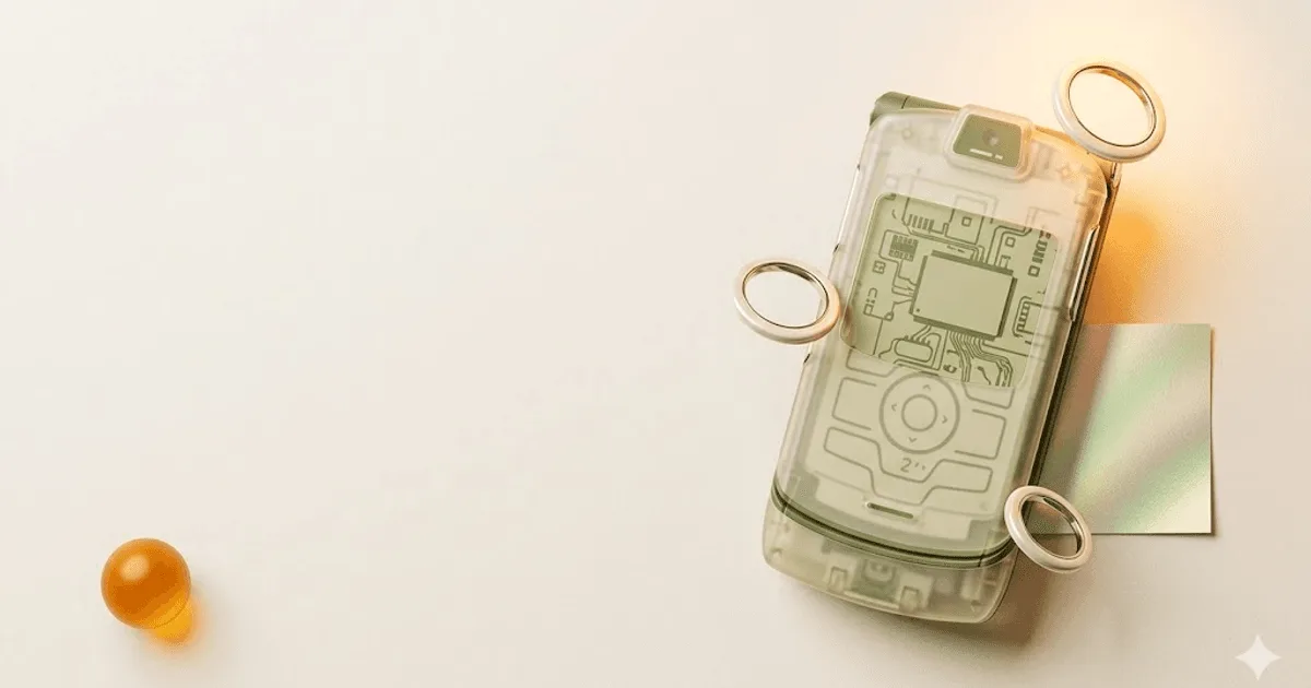
Chrome, frosted blues, and a hot-pink millennium.
Y2K web design is the retro-revival of internet visual language from roughly 1998 to 2003. Chrome textures, frosted iridescent blues, holographic sheen, butterfly hairclips photographed on a flatbed scanner, low-poly 3D renders of CDs and flip phones. The look was repopularized by gen-z on TikTok between 2020 and 2024, and adopted by Depop, SSENSE, and indie music labels as a way to cut through the flat-neutral SaaS consensus that owned 2018 to 2024.
The visual moment ran from late Windows 98 through the introduction of the first iPod. Three forces shaped it: the new metallic and translucent design language Apple shipped with the iMac G3 and the Aqua UI in Mac OS X, the iridescent and chrome plastics Sony pushed into the Walkman and the PlayStation 2, and the optimistic millennium-anxiety mood culture absorbed from movies like The Matrix, Hackers, and Josie and the Pussycats.
What sets Y2K apart from other retro revivals is the specific visual vocabulary. The work is loud on purpose. Lime green sits next to bubblegum pink. Frosted Aqua-blue dialog boxes float over chrome window frames. CD-rom-disc circles appear as background decoration. Cursor trails follow the mouse. The page does not whisper. It announces itself.
For a contemporary brand, the question is not whether Y2K looks cool. It does. The question is whether the audience reads it as expressive or as broken. The rest of this page works through the palette, the typography, the brand fits where it earns attention, and the categories where it actively damages conversion. See our brand identity and web design services for how this style fits a full system.
Where Y2K actually ships today.
Five live references show how Y2K reads in commercial work in 2026. Two are archives that preserve the original moment, three are modern brands using the language in product. Visit each in a new tab and notice what they keep, what they soften, and what they refuse to ship into production.
- Wikipedia · Y2K aesthetic · the canonical reference entry on the movement, with citations to coverage from i-D, Dazed, and The Cut. Use this as the starting timeline before any moodboard.
- archive.org · Wayback Machine · the most honest reference. Browse cartoonnetwork.com, mtv.com, or yahoo.com captures from 1999 to 2002 to see how the language read at native resolution. Filtering through nostalgia is dishonest research; the Wayback Machine forces you to see the originals.
- Depop · the gen-z resale platform whose marketplace surface, seller bios, and editorial features lean hardest on Y2K in mainstream commerce. Look at the search-result grid and the seller-profile pages, not just the marketing site.
- SSENSE · modern luxury ecom with periodic Y2K-leaning editorial drops and campaign pages. Notice how SSENSE quarantines the aesthetic to specific drops, leaving the core catalog UI clean.
- Dazed Digital · fashion coverage · the music and fashion press that drove the revival. Read the editorial framing alongside the visuals; the aesthetic is inseparable from the cultural moment Dazed and i-D reframed for a new generation.
- Designboom · Y2K tag archive · design-press coverage of contemporary product, fashion, and identity work explicitly using Y2K language. Designboom is the most rigorous of the design publications on visual movements.
Chrome, pink, lime, and a holographic gradient.
Six values form the canonical Y2K palette. Chrome silver as the structural surface, bubblegum pink and lime green as the emotional accents, frosted Aqua-blue and cyber navy as the technical depth, and a holographic shimmer gradient for the signature pearl reflectance. Use chrome and navy as 70 percent of the surface area; the loud accents are for moments, not for body text.
| role | name | value | use |
|---|---|---|---|
| structural surface | Chrome silver | #c0c4cc | Window chrome, button bevels, frame edges. Mix with a 2 percent noise texture for the brushed-metal feel. |
| primary accent | Hot bubblegum pink | #ff69b4 | Hero headlines, call-to-action chips, brand mark. Always pair with a darker stroke for legibility. |
| secondary accent | Lime green | #7fff00 | Status pills, hover states, terminal text. Use sparingly; reads aggressive at scale. |
| depth | Frosted Aqua blue | #87ceeb | Translucent dialog boxes, glass overlays, Aqua-style button gloss. The Mac OS X reference shade. |
| structural shadow | Cyber navy | #2e3192 | Body text, window borders, title bars. The single most important contrast partner for hot pink. |
| signature | Holographic shimmer | conic-gradient(...) | Pearl-iridescent CSS gradient cycling through pink, lavender, mint, and silver. Reserved for hero objects and brand-mark backplates. |
Apple Aqua is the single biggest historical reference for the frosted-blue value · cite it in any moodboard so engineering knows what shimmer to ship.
Three faces. Free on Google Fonts.
Y2K typography pairs a wide sci-fi display face with a pixel-arcade accent and a cathode-ray monospaced caption. The pairing below is shippable and free. The original 2000s system used Eurostile, but a free Google Fonts substitute, Orbitron, carries the same wide-geometric energy without licensing fees.
| role | face | historical reference | recommended use |
|---|---|---|---|
| display | Orbitron | Eurostile / Compacta | Hero headlines, 60 to 96 pixels. Weight 700 to 900. Wide letterforms read as sci-fi without the Eurostile license fee. |
| pixel accent | Press Start 2P | NES / arcade ROMs | Badges, hero accents, brand-mark text. 16 to 24 pixels only; loses legibility under 14. Never as body. |
| caption / mono | VT323 | CRT terminal monospace | Captions, timestamps, status text, terminal blocks. 14 to 18 pixels. The cheapest authentic Y2K signal in a system. |
For body copy, do not use any of the three above at 14 to 16 pixels. Use a clean grotesk like Inter or a system stack. Y2K body type was MS Sans Serif because it was the Windows default, not because anyone chose it. Recreate the era without recreating the 2002 readability.
Every Y2K type pairing has a legibility cost. Press Start 2P at 12 pixels is unreadable. Orbitron at 14 pixels for body is hostile. Decide which face holds the brand and which face holds the information, then ship them at the sizes the original 1080p CRT screens never had to support.
Five categories where it earns. Four where it backfires.
Y2K is a high-contrast, gen-z-coded visual language. It works for brands whose audience reads loudness as authenticity, and backfires for brands whose buyers read it as unprofessional or inaccessible. The deciding factor is rarely the product. It is the buyer's age, the regulatory context, and whether the brand is paid to whisper or to shout.
- ✓Gen-z fashion resale and streetwear. Depop-adjacent marketplaces, indie streetwear, customizers. The audience is fluent in the language and rewards it.
- ✓Indie music labels and artist sites. Especially hyperpop, club, and post-internet acts whose sonic identity already references the moment.
- ✓Gaming and esports merch. Y2K reads as a love letter to the PS1, N64, and arcade culture the buyer remembers or has adopted.
- ✓Beauty for under-25 buyers. The chrome, holographic, and lime accents map directly to existing product surfaces (nail, gloss, packaging).
- ✓Nostalgia-led consumer brands and zines. Anyone selling the feeling of a specific year reads the language as accurate, not gimmicky.
- ×Enterprise B2B and SaaS. Procurement and finance buyers read chrome and lime as unprofessional. Lose the deal at the demo.
- ×Healthcare, fintech, legal, government. Regulatory context demands a calm, high-trust surface. Y2K reads as risk.
- ×Accessibility-first or older-audience sites. Chrome plus hot pink fails WCAG AA contrast on most pairings; users over 35 lose the ability to read body copy quickly. WCAG 2.2 is the canonical reference.
- ×Long-form editorial reading sites. The visual loudness fights the reader for attention every paragraph; reading time drops, bounce rate climbs.
The rule of thumb: Y2K is a campaign palette and an editorial palette, not a system palette. SSENSE quarantines it to drops. Healthcare quarantines it to never. If the brand needs to live in B2B and gen-z at once, ship two visual systems with one identity underneath.
A copy-paste prompt for Midjourney or Nano Banana.
The prompt below is calibrated for image generators that respond to material and surface language. It names the chrome reflectance, the iridescent overlay, the lo-fi 3D objects, the early-internet UI chrome, and the negative space the model needs to leave room for headline type. Tune the bracketed values for your brand and run it through Midjourney, Nano Banana, or DALL-E.
Hero composition for a Y2K-aesthetic brand landing page.

Surface and material: chrome silver reflective surfaces in the
mid-foreground, with frosted iridescent translucent overlay
panels in Aqua-blue and lavender. Background contains floating
low-poly 3D objects: a single CD-rom disc tilted 30 degrees, a
butterfly hairclip rendered in plastic, a Y2K-era flip phone in
chrome and translucent purple. No real brand logos.

UI chrome reference: early-internet window frames, beveled
dialog-box edges, Aqua-style glossy buttons, system-default
title bars. Resolution is 1080p; the image should NOT look
modern-polished.

Color palette: chrome silver #c0c4cc as 50 percent of the
surface area, hot bubblegum pink #ff69b4 and lime green #7fff00
as accent stripes on objects, frosted Aqua blue #87ceeb in
overlay panels, cyber navy #2e3192 in deep shadows. One
holographic shimmer gradient cycling through pink-lavender-mint
on the largest object.

Typography zone: leave a horizontal band across the center 40
percent of the frame empty, ready to receive heading type. No
type rendered inside the image.

Mood: optimistic millennium-era technology. NOT polished, NOT
SaaS-template, NOT neon, NOT vaporwave-dreamlike. Closer to a
1999 product shoot than a 2024 render. Slight film grain.

Aspect ratio 16:9. High detail on the chrome reflections; low
detail on the background fill. The composition should feel
designed, not generated.
Iterate by tuning one bracket at a time. Change the foreground object first (CD → flip phone → butterfly), then the overlay (Aqua → iridescent), then the palette weight. Three runs is usually enough to land the brand direction.
Five answers.
What is Y2K web design?
Y2K web design is the retro-revival of internet visual language from roughly 1998 to 2003. It centers on chrome and silver surfaces, holographic or iridescent gradients, hot pink and lime green palettes, low-poly 3D objects like CDs and flip phones, butterfly and star motifs, and early-internet system typography such as Press Start 2P, VT323, and MS Sans Serif. The style was re-popularized on TikTok between 2020 and 2024, and crossed into commercial work through gen-z resale platforms, indie music labels, and modern Y2K-leaning fashion ecommerce.
Why is Y2K aesthetic popular in 2026?
Two reasons. First, the 20-year nostalgia cycle has pulled the late 1990s and early 2000s into gen-z's reference frame the way the 1980s came back for millennials in the 2010s. Second, the visual loudness of Y2K cuts through the flat, neutral, system-font consensus that dominated 2018 to 2024 commercial design. Brands using Y2K in 2026 are buying contrast - against beige minimalism, against AI-generated soft-pastel sameness, and against the over-polished SaaS template look. Depop, SSENSE, indie music labels, and gaming merch lines have all leaned on it for that reason.
What is the difference between Y2K and vaporwave?
Y2K and vaporwave overlap but mean different things. Y2K is the literal visual language of 1998 to 2003 - chrome, frosted plastic, lo-fi 3D objects, hot pink and lime green, early-internet UI chrome. It looks forward into the millennium with optimism. Vaporwave is a 2010s art movement that samples 1980s and 1990s corporate, mall, and Japanese-import aesthetics through an ironic, dreamlike, often melancholic lens. Vaporwave uses pastel pink and teal, classical statuary, Japanese kanji, and slowed-down sound. Y2K celebrates the moment. Vaporwave grieves it.
What fonts work for a Y2K website?
Four typefaces carry most of the workload. Orbitron - a free Google Font - covers the wide, futuristic Eurostile feel for display headlines. VT323 brings cathode-ray-tube monospaced terminal energy for captions and labels. Press Start 2P delivers the 8-bit pixel arcade look for hero accents and badges. MS Sans Serif or a free clone like W95FA recreates the system-default Windows 98 dialog-box nostalgia for UI chrome and menu strips. Pair one display face with one accent face and one system face - never all four at once. Display 60 to 96 pixels, body 14 to 16 pixels for legibility.
Is Y2K design good for ecommerce?
Yes for the right category, no for everything else. Y2K works for gen-z fashion resale (Depop, Vinted-adjacent), indie streetwear, music merch, gaming and esports, beauty brands targeting under-25 buyers, and nostalgia-led consumer products. SSENSE has used Y2K-leaning art direction on landing pages and editorial features without breaking conversion. It backfires on enterprise B2B, healthcare, fintech, accessibility-first sites, and any product where over-35 buyers make the purchase decision. Chrome plus hot pink fails WCAG contrast more often than not, so any Y2K ecommerce build needs a fallback high-contrast mode at the framework level.
Want a Y2K direction that ships clean?
Y2K is a sharp tool. Used on the right brand it earns attention the rest of the category cannot buy. Used on the wrong brand it kills the deal at the demo. A 30-minute call diagnoses whether it fits the audience, the regulatory context, and the system you actually need to ship.

More from Priyanka.
Senior UX Designer · UK · London · 2 posts on the site
Published .