Bauhaus web design, form follows function.
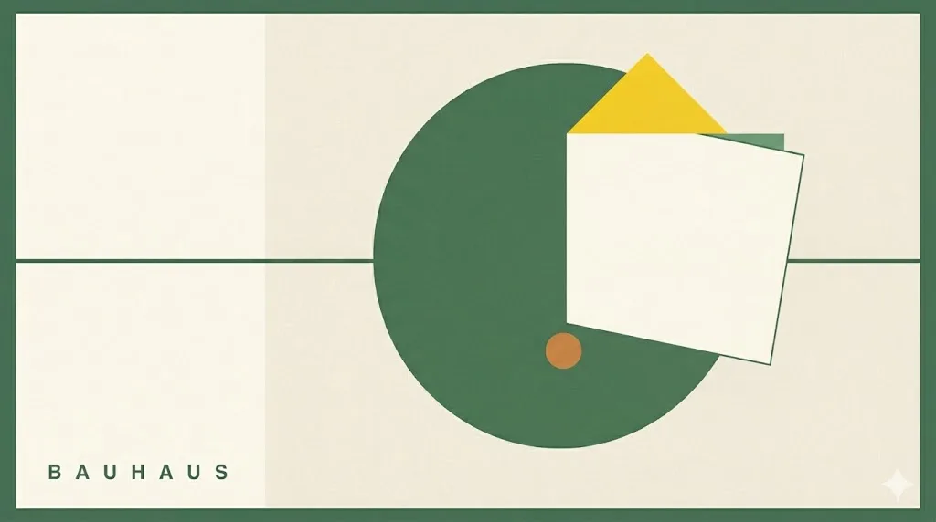
The 1919 German design school reborn for the web — pure-white field, red triangle, yellow circle, blue square, geometric sans-serif typography. A style guide for industrial design firms, architecture practices, modernist galleries, and furniture brands chasing modernist clarity.
- Bauhaus web design = the 1919 Weimar school revived for the screen; primary-colour geometric reduction (red triangle, yellow circle, blue square), sans-serif geometric typography, no decoration.
- Founded by Walter Gropius in April 1919, the school moved Weimar → Dessau → Berlin and closed under Nazi pressure in 1933. Faculty included Kandinsky, Klee, Albers, Moholy-Nagy.
- Palette is bauhaus red #d42220, bauhaus blue #0050b3, bauhaus yellow #f4cc00, pure black, pure white, neutral gray. Type pairing is Josefin Sans display, Roboto body, JetBrains Mono utility.
- Right for industrial design firms, architecture practices, design schools, modernist galleries, furniture brands. Wrong for lifestyle warmth, generative AI creative agencies, kids and family brands.
- Revived post-2018 as anti-skeuomorphic clarity. The 2019 Bauhaus centenary plus AI-image fatigue have kept the movement running strong into 2026.
A 1919 school reborn for the screen.
Bauhaus web design is the digital application of a design philosophy formalised over a hundred years ago. The Staatliches Bauhaus opened in Weimar, Germany, in April 1919 under the directorship of Walter Gropius, a German architect who had trained under Peter Behrens. The school's manifesto called for the unification of art, craft, and industry, and its working principles produced the most influential design vocabulary of the twentieth century: primary-colour geometric reduction, sans-serif typography as architecture, no decoration that did not carry a function. On the screen this becomes a pure-white field, a red triangle, a yellow circle, a blue square, and one moss-or-graphite hairline rule slicing through the composition.
The school moved twice. From Weimar it relocated to Dessau in 1925, where Gropius designed the steel-and-glass Bauhaus Dessau building that became the school's permanent visual signature. Hannes Meyer took the directorship in 1928 and pushed the school further toward social-design rigour. Mies van der Rohe ran it in Berlin from 1930 until the Nazi regime forced its closure in 1933. The diaspora that followed sent Albers to Black Mountain College, Gropius and Breuer to Harvard, Moholy-Nagy to Chicago, and Mies van der Rohe to Illinois Institute of Technology — each carrying the Bauhaus vocabulary into a new continent.
The web revival began around 2018 as a quiet counter-move. Skeuomorphism had collapsed into flat design, flat design had collapsed into a soft-pastel template homogeneity, and designers wanted a credentialed historical reference to argue for stripped-back work. The 2019 Bauhaus centenary supplied it. Bauhaus-Archiv Berlin reopened with an expanded permanent collection. Vitra and Knoll reissued their archive pieces. The visual language returned to the web through designer-led storefronts, modernist gallery sites, and architecture-practice portfolios. The 2024 generative-AI image glut accelerated the trend — primary-colour geometric reduction is one of the few visual languages that AI-generated images still struggle to render with conviction, which makes it a useful human-curated signal in 2026.
Five reference sites built on Bauhaus principles.
The fastest way to internalise Bauhaus web design is to spend ten minutes on the institutions that hold the original archive plus the brands keeping the visual language commercially active. The five below cover the museum, the furniture lineage, the typographic revivals, and the contemporary commercial archive that re-issues the school's graphic work.
- Bauhaus-Archiv Berlin — the canonical museum, holding the largest collection of Bauhaus-era documents, furniture, typography specimens, and student work. The website itself is the primary reference for how the school's visual identity reads on a screen.
- Vitra — the Swiss furniture brand that manufactures the Bauhaus-era classics (Breuer's Wassily chair, Mart Stam's S33 cantilever) and runs the Vitra Design Museum. The product photography and the editorial pages carry the modernist composition forward.
- Knoll — the American manufacturer that holds the Mies van der Rohe collection (Barcelona Chair, Brno Chair) plus the Saarinen and Bertoia heritage. The Knoll site treats the Bauhaus archive as a living commercial catalogue rather than a museum piece.
- Fontsmith — the London-based foundry whose modernist typography revivals carry the Bauhaus geometric vocabulary into licensed digital typefaces. Useful as a reference for the difference between Bauhaus-inspired display faces and the original 1927 specimens.
- Bauhaus Movement — the commercial archive selling reproduction prints, furniture, and graphic-design objects. Reads as the most explicitly branded use of the Bauhaus visual identity on the contemporary web.
What none of them share: gradient backgrounds, drop-shadows, scroll-jacked storytelling, decorative micro-illustration. The Bauhaus discipline is what is left after every visual flourish has been argued out of the room.
Three primaries, two neutrals, one middle gray.
The Bauhaus palette is one of the most rigorously argued colour systems in design history. Wassily Kandinsky paired red with the square, yellow with the triangle, and blue with the circle in his 1923 colour-form theory; Josef Albers later inverted the pairing in his teaching at the school. Today's Bauhaus web work uses the three primaries plus pure black, pure white, and a single neutral gray to anchor the composition. No tertiary colours. No pastels. No designer-blue brand alternatives.
| swatch | name | hex | role |
|---|---|---|---|
| Bauhaus red | #d42220 | primary / square accent | |
| Bauhaus blue | #0050b3 | primary / circle accent | |
| Bauhaus yellow | #f4cc00 | primary / triangle accent | |
| Pure black | #000000 | ink / hairline rules | |
| Pure white | #ffffff | paper / canvas | |
| Neutral gray | #808080 | secondary text / structural |
Notice the absence of any tertiary, brand variant, or gently desaturated alternative. Bauhaus uses pure primaries or pure neutrals, nothing between. Anything in between reads as a compromise the school would have argued against in its first faculty meeting.
Three geometric faces. None of them decorative.
Bauhaus typography is geometric sans-serif. The reference is Futura, designed by Paul Renner in 1927 around the school's principles (though Renner himself was not a Bauhaus instructor). On the web, Futura is a licensed face, so most contemporary Bauhaus work pairs the closest free alternative for display (Josefin Sans, built explicitly on geometric Bauhaus principles) with a neutral grotesque for body copy. The display face does the architectural work; the body face stays out of the way.
| role | typeface | weight / style | source |
|---|---|---|---|
| display | Josefin Sans | Light 300 / Bold 700 | Google Fonts |
| body | Roboto | Regular 400 / Medium 500 | Google Fonts |
| utility / code | JetBrains Mono | Regular 400 | Google Fonts |
| editorial alt | Bree Serif | Regular 400 | Google Fonts |
The pairing rule: pick one geometric sans for display, one neutral grotesque for body, one mono for utility. Avoid three display faces; the resulting page reads as a typography sample sheet rather than a Bauhaus composition.
When Bauhaus is the right reference. And when it backfires.
Bauhaus web design is a positioning move first and an aesthetic choice second. It reads as serious, modernist, and historically credentialed. That helps brands whose buyers respect design history. It actively damages brands whose buyers need to feel a warm welcome rather than walk into a museum lobby.
Where Bauhaus works.
- Industrial design firms — the lineage is literal. Buyers expect the visual reference to track back to the discipline's foundational school.
- Architecture practices — Gropius, Mies van der Rohe, and Breuer were all architects first. The reference flatters the practice.
- Design schools and academic departments — the visual language signals teaching authority without resorting to crest-and-quill cliche.
- Modernist galleries and museums — the page becomes a curatorial argument before a single artwork is shown.
- Furniture brands — especially those with Bauhaus-era inventories (Knoll, Vitra, Cassina) or modernist reissues.
- Editorial and publishing imprints — particularly design publishers whose readers index for modernist references.
Where it actively damages the brand.
- Lifestyle warmth brands — wellness, slow living, hospitality. Bauhaus reads cold and academic; the brand needs softness instead.
- Generative AI creative agencies — Bauhaus is a closed system. The school argued there was a right answer. Generative-creative brands want a posture of permitted surprise.
- Kids, family, and education for under-12 — the visual rigour reads as institutional. Kids' brands want playful breakable geometry, not the canonical version of it.
- Direct-to-consumer indulgence categories — chocolate, fragrance, jewellery. Bauhaus signals discipline; the category sells permission.
The accessibility risk is smaller than with brutalism. Bauhaus typography is large, sans-serif, and high-contrast. The trap is colour contrast on the yellow accent — bauhaus yellow at small text sizes on pure white routinely fails WCAG AA, so restrict yellow to large display elements and shape blocks, never body text.
The honest test: if the brand wants to be respected, Bauhaus works. If the brand wants to be loved, pick something warmer.
One copy-paste prompt for v0, Midjourney, or Claude.
The prompt below is tuned for image-generation models (Midjourney, Nano Banana Pro) and code-generation models (v0.dev, Claude Artifacts). It states the constraints Bauhaus depends on: primary-colour geometric reduction (red triangle, yellow circle, blue square), pure-white field, sans-serif geometric typography, hairline grid, and the explicit prohibition of decoration, shadows, gradients, or noise that any 2024-era model will otherwise apply by default.
Paste the prompt into your tool of choice. Models trained on contemporary design data will try to soften the result toward a generic flat-design output. The "no decoration, no shadow, no gradient, no noise" line is the single most important constraint — remove it and the output stops being Bauhaus.
Generate a Bauhaus revival web design landing page for a [BRAND NAME /
ONE-LINE DESCRIPTION] in the [INDUSTRIAL DESIGN / ARCHITECTURE PRACTICE /
DESIGN SCHOOL / MODERNIST GALLERY / FURNITURE BRAND] category.

PALETTE (strict, no other colours):
- background: pure white #ffffff
- ink and display type: pure black #000000
- primary one (square accent, heaviest visual mass): bauhaus red #d42220
- primary two (circle accent, cool counterweight): bauhaus blue #0050b3
- primary three (triangle accent, energy): bauhaus yellow #f4cc00
- secondary text and structural rules: neutral gray #808080

TYPOGRAPHY:
- display: Josefin Sans, light 300 for hero, bold 700 for emphasis;
  geometric sans-serif posture, generous letter-spacing on uppercase
- body: Roboto regular 400, 16px minimum, 1.6 line-height
- utility, captions, hex values: JetBrains Mono regular 400

LAYOUT RULES (hard constraints):
- primary-colour geometric reduction: one red square, one yellow circle,
  one blue triangle composed asymmetrically on the canvas
- pure-white field; the geometry sits ON the field, not in containers
- one moss-or-graphite hairline rule (1px black or neutral gray)
  slicing through the composition at an architectural angle
- typography is treated as architecture: large display headlines aligned
  to the geometric grid, body text in a single column
- no decoration, no shadow, no gradient, no noise, no texture, no blur
- no rounded corners on the geometric primitives (the square is square,
  the triangle is sharp, only the circle is round)
- buttons are flat coloured rectangles, no border, no shadow, no hover
  animation other than a direct colour swap
- maximum one image or photograph on the page, treated with the same
  geometric discipline (full-bleed or constrained to a primary shape)

DELIVERABLE: a single self-contained HTML file with inline CSS. No
JavaScript unless the user explicitly asks for an interaction. Reference
Wassily Kandinsky's "Composition" series and the 1923 Bauhaus
colour-form theory as the underlying compositional logic.

Do not apply any contemporary design polish. Accept that the result
should read as the historical Bauhaus reference, not as a Bauhaus-inspired
modern app.
Models trained on 2023+ design data lean toward soft-pastel flat design unless explicitly constrained. The "do not apply any contemporary design polish" closing line is what keeps the output historically honest.
Five answers.
What is Bauhaus web design?
Bauhaus web design is a modernist style adapted from the German Bauhaus school (1919-1933). It applies the school's core principles to digital screens: primary-colour geometric reduction (red triangles, yellow circles, blue squares on a pure-white field), sans-serif typography (Futura, Avenir, Josefin Sans), the "form follows function" design ethic, and the harmony of art, craft, and industry. The style stripped decoration back to its load-bearing elements and treated typography as architecture. The web revival, peaking around the school's 2019 centenary and persisting through 2026, returned to these constraints as a counter-move against skeuomorphic clutter and decorative noise.
Who founded the Bauhaus school?
Walter Gropius founded the Staatliches Bauhaus in Weimar, Germany, in April 1919. Gropius was a German architect who had worked under Peter Behrens (alongside Le Corbusier and Mies van der Rohe). He led the school through its Weimar phase (1919-1925), after which the school moved to Dessau and Gropius designed the iconic Dessau Bauhaus building. Hannes Meyer succeeded Gropius in 1928, and Mies van der Rohe took the directorship in 1930 and ran the school until the Nazi regime forced its closure in Berlin in 1933. The faculty included Wassily Kandinsky, Paul Klee, Josef Albers, Laszlo Moholy-Nagy, and Marcel Breuer, whose collective output defined twentieth-century modernist design. See the Walter Gropius biography for the full directorship sequence.
Bauhaus vs Swiss design: what is the difference?
Bauhaus came first (1919-1933, Germany) and pushed primary-colour geometric reduction, the art-craft-industry trinity, and an idealistic vision of design as social reform. Swiss design (also called the International Typographic Style) emerged in 1950s Zurich and Basel, taking Bauhaus typography forward but trading colour for monochrome neutrality, the geometric triangle-circle-square vocabulary for the mathematical grid, and the idealism for rationalism. Helvetica (1957) and Univers (1957) were Swiss; Futura (1927) was Bauhaus-adjacent. Bauhaus reads emotional within constraints; Swiss reads coolly systematic. Designers often confuse them because both prize sans-serif typography, grids, and minimal decoration. See the Swiss grid style page for the sibling comparison.
What fonts work for a Bauhaus website?
The original Bauhaus typography was geometric sans-serif. Paul Renner designed Futura in 1927, and although he was not a Bauhaus instructor, Futura sits at the centre of the movement's typographic identity. For the web, the closest free alternative is Josefin Sans (Google Fonts), built explicitly on geometric Bauhaus principles. Avenir Next (Adrian Frutiger, 1988) is the licensed gold standard. For body copy, pair the geometric display face with Roboto or Inter to keep readability at small sizes. For utility text and code, JetBrains Mono works. Avoid mixing in serif typefaces unless you are doing an editorial insert, in which case Roboto Slab or Bree Serif both carry a geometric posture.
Why is Bauhaus design coming back in 2026?
Three forces. First, the 2019 Bauhaus centenary triggered a wave of museum, publisher, and brand reissues (Bauhaus-Archiv Berlin's expanded museum, Vitra's centenary exhibitions, Knoll's Mies van der Rohe reissues) that re-introduced the visual vocabulary to a new generation. Second, the web tired of skeuomorphism and 3D maximalism; designers wanted a credentialed modernist reference to argue for stripped-back work, and Bauhaus is the most legible reference in design history. Third, post-AI-image-glut, primary-colour geometric reduction is one of the few visual languages that AI-generated images still struggle to mimic with conviction, so brands wanting a human-curated look reach for it. The revival is documented across designboom Bauhaus coverage and the Bauhaus Movement commercial archive.

More from Devon.
Senior Account Director · DTC · New-york · 9 posts on the site
Published .