Brutalist web design, raw on purpose.
The 2014-onwards anti-design movement — pure black on pure white, Helvetica Bold ALL-CAPS, exposed page structure, default browser blue links. A style guide for rebellion brands, indie zines, and anti-corporate fashion houses.
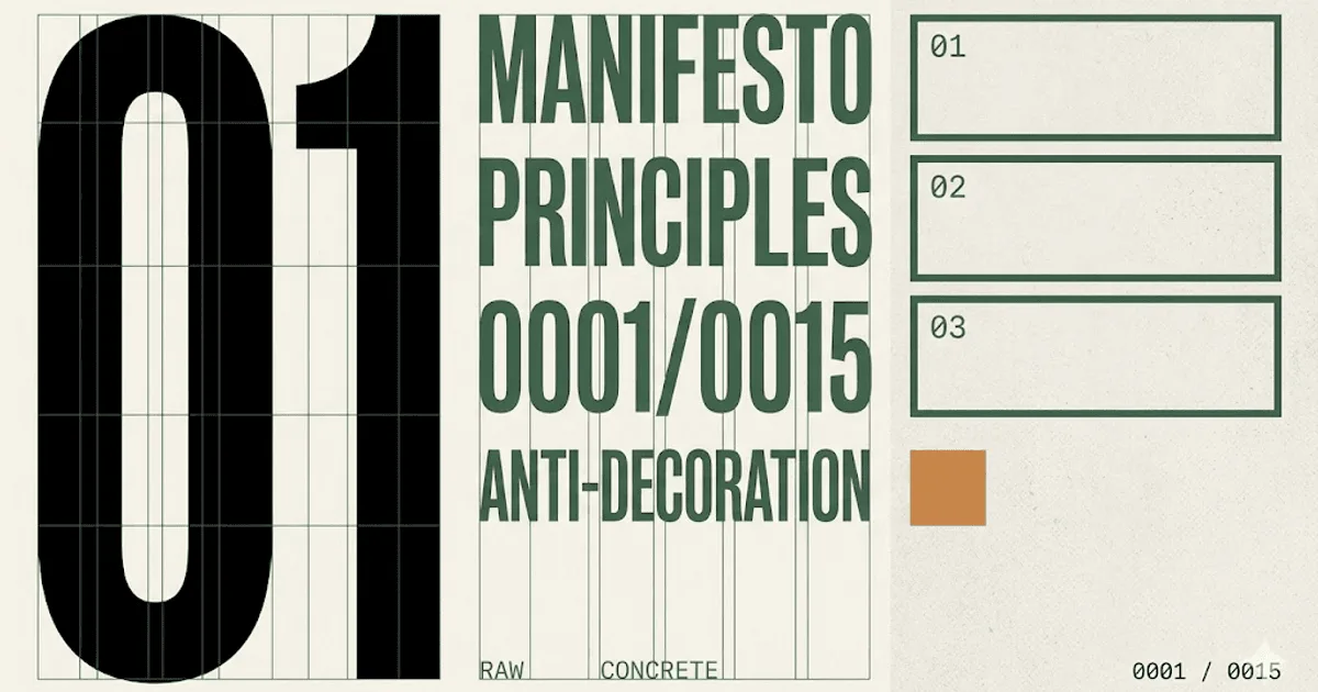
- Brutalist web design = the 2014-onwards anti-design movement; raw monospace, exposed structure, default browser primitives, intentional ugliness as authenticity signal.
- Brutalism is genuinely awkward. Neo-brutalism keeps the raw look with polished UX underneath. Most commercial work today is neo, not pure brutalism.
- Palette is pure black, pure white, concrete gray, one hot accent (often red), default link blue, system yellow. Type is Helvetica Bold ALL-CAPS plus IBM Plex Mono body.
- Right for rebellion brands, art galleries, indie zines, anti-corporate fashion, hackers, music labels. Wrong for ecommerce checkout, healthcare, finance, anything reading-heavy.
- Ships fast (small CSS, few images, no heavy fonts) but needs deliberate accessibility work; default red-on-white fails WCAG AA at most weights.
The 2014-onwards anti-design movement.
Brutalist web design is a deliberate rejection of polished web conventions. Pure black on pure white. Helvetica Bold ALL-CAPS. Monospace body. Default browser blue links. Asymmetric blocks of raw text. Zero shadows, no rounded corners, no gradient overlays, no scroll-jacking. The aesthetic borrows its name from architectural Brutalism — the post-war movement of raw concrete and exposed structural elements documented across mid-century civic buildings.
The web movement crystallised in 2014 when designer Pascal Deville launched brutalistwebsites.com, a curated archive of sites that broke from the soft-edged template SaaS look dominating the web at the time. The archive framed brutalism as ruggedness, honesty, and a willingness to look ugly in service of identity. Web brutalism as a documented design movement grew from there, spawning two distinct branches.
The first branch is pure brutalism — genuinely awkward, deliberately confronting, often inconvenient. Robpike.io (the personal site of the Go language co-creator) is the classic specimen. The second branch is neo-brutalism — raw aesthetic, polished UX underneath. Thick black borders, hard offset drop-shadows, primary-coloured blocks, default fonts, but every button clicks predictably and every form validates. Most commercial work shipped under the brutalist label since 2021 is actually neo. Knowing which one a brand is asking for saves a tear-down on day two.
Five live sites running raw on purpose.
The fastest way to internalise brutalist web design is to spend ten minutes on the sites that built the movement. The five below cover the full range — editorial graphic, anti-luxe fashion, provocation marketing, hacker-canonical personal site, and the curated archive that named the movement.
- Bloomberg Businessweek — the graphic-editorial extreme. Oversized headlines, screaming colours, ALL-CAPS, deliberate layout chaos. Sets the editorial-brutalism reference for any publisher wanting to look serious and confrontational at once.
- Balenciaga — the anti-luxe storefront that broke fashion ecommerce convention. System sans-serif, near-zero ornamentation, blunt product photography. Reads as a statement: we do not need to seduce you.
- MSCHF — the provocation brand whose entire commercial model depends on looking like an exploit. Each product drop pages reads like a hastily-deployed art project, which is the point.
- robpike.io — Go language co-creator Rob Pike's personal site. Plain text, no CSS to speak of, no images. The Internet-original specimen of hacker brutalism, which signals technical authority by refusing to dress up.
- Brutalist Websites — Pascal Deville's curated archive. The reference library every designer pitching brutalism eventually links to. Spend an hour scrolling and the family resemblance becomes obvious.
What none of them share: stock photography, lifestyle imagery, polished hero videos, scroll-jacked storytelling. Brutalism is what is left after you remove every soft-edged convention.
Six colours, including the default link blue.
Brutalist palettes are short and emotionally loaded. Pure black for ink, pure white for paper, one concrete grey, one hot accent (red is the canonical choice), and crucially the default browser blue for links — not a designer-chosen brand blue. Letting the browser pick the link colour is part of the philosophy: you are signalling that the page is structure, not surface.
| swatch | name | hex | role |
|---|---|---|---|
| Pure white | #ffffff | paper / canvas | |
| Pure black | #000000 | ink / display type | |
| Concrete gray | #c9c9c9 | rule lines / inactive | |
| Hot accent red | #ff2d2d | single bleeding accent | |
| Default link blue | #0000ee | hyperlinks | |
| System yellow | #ffe600 | highlight / annotation |
Notice the absence of any tertiary, brand-blue, or any colour that has been gently desaturated. Brutalism either uses pure primaries or uses the browser default. Anything in between reads as half-committed.
Three faces. None of them premium.
The typography pairing tells you the page is brutalist before you read a word. Helvetica Bold ALL-CAPS for display, monospace for body and captions, occasional Times New Roman for editorial inserts. Using free or system-installed fonts is part of the philosophy — paying for a premium typeface defeats the anti-commercial posture.
| role | typeface | weight / style | source |
|---|---|---|---|
| display | Helvetica Bold | ALL-CAPS / 700 | system / Helvetica Now alternative |
| body + captions | IBM Plex Mono | Regular 400 / Bold 600 | Google Fonts |
| body alternate | Roboto Mono | Regular 400 | Google Fonts |
| editorial insert | Times New Roman | Regular 400 / Italic | system default |
The point of the pairing is that none of it should look like a designer agonised over it. Pick the system default. Pick Google Fonts. Anything that reads as "we chose a premium variable font" is no longer brutalist.
When brutalism is the right call. And when it backfires.
Brutalist web design is a positioning move first and an aesthetic choice second. It works when the brand needs to read as confrontational, technical, or anti-corporate — and it actively damages brands that need to read as warm, trustworthy, or accessible. Five archetypes where it fits, three where it does not.
Where brutalism works.
- Rebellion brands — the entire pitch is anti-mainstream. The aesthetic does the positioning work for you.
- Art galleries and indie zines — brutalism reads as honest curation rather than commercial sleight-of-hand.
- Anti-corporate fashion houses — Balenciaga, Vetements, MSCHF, and the entire post-Demna luxury contingent.
- Hackers and developer tools — pure brutalism (no shadows, no rounded corners, no gradient buttons) signals "engineers built this for engineers."
- Music labels and DJ portfolios — the style pairs naturally with bold, rhythm-led promotional aesthetics.
- Conceptual art and experimental writing — the page itself becomes a statement object.
Where it actively damages the brand.
- Ecommerce checkout — buyers second-guess every step. Cart abandonment rises measurably; the style is not worth the conversion hit.
- Healthcare and finance — buyers need to feel reassured, not provoked. Brutalism signals "we do not care about you." Wrong frequency.
- Anything reading-heavy — long-form content fails on monospace body type at small sizes. Educational sites, knowledge bases, documentation: pick a humanist sans-serif instead.
Accessibility audits will flag the hot-red text issue on day one. Plan for it: either restrict red to ALL-CAPS large display weights or run every red/white pairing through a WCAG 2.1 contrast checker before shipping.
The honest test: if buyers need to trust the page, brutalism is the wrong tool. If they need to be impressed by the page, it is often the right one.
One copy-paste prompt for v0, Midjourney, or Claude.
The prompt below is tuned for image-generation models (Midjourney, Nano Banana Pro) and code-generation models (v0.dev, Claude Artifacts). It states the constraints brutalism depends on — harsh monospace, asymmetric blocks, no rounded corners, no shadows, default browser link colours, single bleeding accent. Strip or add the last line depending on whether you want a single landing page or a full mood-board image.
Paste the prompt into your tool of choice. The output will be closer to neo-brutalism than pure brutalism by default; if you want pure brutalism, add the line "do not apply any modern UX polish, do not soften any element, accept that the result will be deliberately ugly" at the bottom of the prompt.
Generate a brutalist web design landing page for a [BRAND NAME / ONE-LINE
DESCRIPTION] in the [REBELLION FASHION / INDIE MUSIC LABEL / ART GALLERY / DEV
TOOL / ANTI-CORPORATE CONSUMER GOODS] category.

PALETTE (strict, no other colours):
- background: pure white #ffffff
- ink and display type: pure black #000000
- rule lines and inactive states: concrete gray #c9c9c9
- single bleeding accent (use sparingly, max one block per viewport): hot red
  #ff2d2d
- hyperlinks: default browser blue #0000ee, underlined, visited #551a8b
- one highlight tone for inline annotation only: system yellow #ffe600

TYPOGRAPHY:
- display: Helvetica Bold ALL-CAPS, no letter-spacing, no italic
- body and captions: IBM Plex Mono (or Roboto Mono), regular 400 weight,
  16px minimum, 1.55 line-height
- block quotes and footnotes: Times New Roman regular, italic permitted

LAYOUT RULES (hard constraints):
- asymmetric blocks of raw text, not a grid system
- no rounded corners on ANY element (border-radius: 0)
- no drop-shadows, no gradients, no glassmorphism, no blur effects
- one accent block (the hot red) bleeds off the canvas edge by 5-15% of
  viewport width
- buttons are flat rectangles, black border, no hover animation other than
  inverted colour
- forms use system-default inputs, no custom styling
- max two images on the page, both full-bleed, no rounded corners
- typography drives hierarchy; visual decoration does not exist

DELIVERABLE: a single self-contained HTML file with inline CSS. No
JavaScript unless the user explicitly asks for an interaction.

Do not soften any element. The result should look deliberately raw.
Models trained on 2023+ design data lean toward neo-brutalism unless explicitly constrained. The "do not soften" closing line is what keeps the output honest.
Five answers.
What is brutalist web design?
Brutalist web design is a 2014-onwards anti-design movement that rejects polished web conventions. It uses raw monospace text, pure black on pure white, Helvetica Bold ALL-CAPS, default browser blue links, asymmetric blocks, and zero decorative effects like shadows or rounded corners. The name borrows from architectural Brutalism (raw concrete, exposed structure) via Pascal Deville's Brutalist Websites archive launched in 2014. It signals authenticity, anti-corporate posture, or technical bona fides depending on who is using it.
Is brutalist web design good for SEO?
Brutalist sites tend to perform well on Core Web Vitals because they ship almost no CSS, no large hero images, no heavy fonts, and no parallax. That helps LCP and INP. Where they hurt SEO is accessibility: high-contrast hot-red text on white frequently fails WCAG 2.1 AA contrast in specific weight combinations, and ALL-CAPS body copy reduces readability for screen readers and dyslexic users. The honest answer: brutalist web design is good for technical SEO and neutral-to-poor for accessibility SEO. See the Core Web Vitals reference for the LCP/INP/CLS thresholds.
Brutalism vs neo-brutalism: what is the difference?
Brutalism is intentionally raw and often genuinely awkward to use. Pages overlap, text runs off the edge, the cursor sometimes does unexpected things. Neo-brutalism (popularised by Gumroad, Linear's early marketing, and several Vercel community templates) keeps the raw aesthetic (thick black borders, hard offset shadows, default-ish typography, primary colour blocks) but layers polished UX underneath. Buttons still click predictably, forms still validate. Neo-brutalism is the commercial-friendly grandchild of brutalism.
Is brutalist web design accessible?
Not by default. Three accessibility risks recur. First, hot accent red on pure white frequently fails WCAG 2.1 AA contrast at smaller weights. Second, ALL-CAPS display type slows reading speed for everyone and creates pronunciation problems for screen readers. Third, monospace body type at small sizes hurts dyslexic readers. Brutalism can be made accessible by checking contrast on every text colour pairing, using ALL-CAPS only for headings (not body), and keeping body type at 16px+ with a generous line-height. Done right, raw does not have to mean exclusionary.
Why are big brands like Balenciaga using brutalist web design?
Anti-luxe positioning. When every direct-to-consumer fashion brand uses the same soft-pastel scroll-jacked storefront, looking deliberately ugly is a status move. It signals you do not need to chase conventional appeal. Balenciaga relaunched with a brutalist storefront in 2022 after Demna's runway pivot to anti-fashion. MSCHF uses brutalist web design for similar reasons: the aesthetic communicates that the brand is in on a joke the visitor is supposed to figure out. It is exclusionary by design, which makes it aspirational.

More from Saanvi.
Senior Shopify Engineer · B2B · Delhi · 3 posts on the site
Published .