01 · spline
spline.design
The defining browser-first 3D tool of the era. Spline templates ship clay scenes ready to embed in React. Watch how shadows and clay material are calibrated on their own marketing site.
A friendly plasticine-feeling 3D style with rounded edges, top-down lighting, and zero glossy chrome. Built for SaaS onboarding, education tech, and family brands.
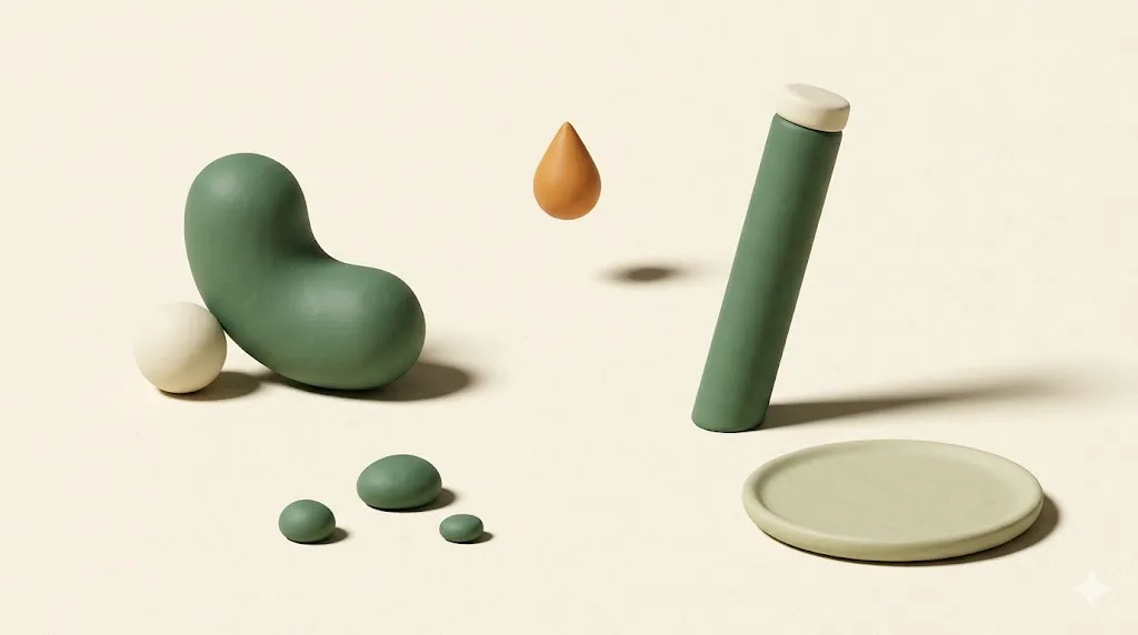
3D clay illustration is a rendering style defined by matte clay-feeling surfaces, rounded geometry, pastel palettes, and soft top-down lighting. It rejects glossy metal, harsh reflections, and high-contrast shadows. Pablo Stanley's Blush illustration library popularised the look around 2020; Spline made it production-cheap in 2021.
The aesthetic borrows from plasticine stop-motion animation. Studios like Aardman (Wallace and Gromit) and Laika (Coraline) trained two generations of viewers to read clay surfaces as warm, handmade, and friendly. The web style takes that emotional vocabulary and pushes it through a 3D pipeline: matte shaders, rounded chamfers on every edge, occlusion shadows kept gentle, and a colour script that almost always sits in the pastel half of the wheel.
Three things made it spread. First, Pablo Stanley's Blush library gave non-3D designers a drag-and-drop way to compose clay characters and scenes inside Figma. Second, Spline shipped a browser-first 3D editor with one-click React export, dropping the cost of an animated clay scene from days to hours. Third, founder-led SaaS noticed the friendliness moved signup conversion on top-of-funnel pages where buyers had not yet decided to trust the product.
The result is a style that lives mostly in pastel territory, often paired with friendly geometric sans-serif typography, and shows up in the onboarding screens of products that want to feel less like a database and more like a workspace. Sister styles to know about: glassmorphism (translucent surfaces, hard edges) and neumorphism (extruded soft UI, no colour). Clay 3D is warmer than both.
Five working studios and libraries to study before you brief a clay 3D project. Open each in a tab, scroll the marketing site, then open the live templates or asset packs. The fastest education in the style is one focused afternoon across these five.
The defining browser-first 3D tool of the era. Spline templates ship clay scenes ready to embed in React. Watch how shadows and clay material are calibrated on their own marketing site.
Pablo Stanley's Blush illustration library includes several clay 3D packs that work as a vocabulary primer. Study the consistent shadow softness and the deliberately narrow colour script per pack.
A studio that uses clay-adjacent 3D in production for client work. Hello Monday case studies are a benchmark for how to move past the Figma-default look toward something with art direction.
Filter Framer templates for 3D and clay. Useful as a survey of how startup-class teams ship the style with reasonable craft floors.
A growing free library of clay 3D illustrations, organised by use-case (onboarding, empty states, error pages). Faster than commissioning a new scene when the brief is generic. Cross-reference Dribbble's 3D illustration tag for individual designer portfolios.
Clay 3D lives in pastel territory. A working palette uses two or three pastels as the dominant scene colour, a neutral cream as the paper-feel background, and one accent that carries the call-to-action. The six swatches below are a defensible starting point for a SaaS onboarding flow or an edtech landing page.
| Swatch | Name | Hex | Role in scene |
|---|---|---|---|
| Pastel mint | #b8e6c1 | Dominant 1. Use on the largest clay object in the scene. | |
| Pastel pink | #ffb7c5 | Dominant 2. Pairs naturally with mint for warmth balance. | |
| Pastel butter | #fff3a0 | Highlight. Use for one cheerful prop per scene. | |
| Soft lavender | #d8b4fe | Secondary. Carries shadow undertones in pink-heavy scenes. | |
| Soft sky | #b3dafe | Sky or background block. Quiet, recedes behind clay objects. | |
| Neutral cream | #faf7f2 | Paper-feel base. Use as the page background under the scene. |
The palette deliberately avoids saturated red, true black, and high-chroma electric blue. Once a swatch crosses about 70 percent saturation, the clay illusion breaks and the scene reads as cartoon plastic instead of plasticine. Treat the six values above as a ceiling, not a starting point.
Clay illustration wants a sans-serif partner with high x-height, soft terminals, and friendly geometry. Avoid sharp grotesks and condensed display faces. The three Google Fonts below pair with the palette and run at acceptable byte cost for SaaS marketing sites.
| Role | Family | Weight stack | Why it pairs |
|---|---|---|---|
| Display | Plus Jakarta Sans | 700, 800 | Slightly rounded geometric sans. Friendly without losing structure at H1 scale. |
| Body | DM Sans | 400, 500 | Neutral grotesque with rounded corners. Reads cleanly at 16 pixels. |
| Alt body | Nunito | 400, 600 | Heavier rounded terminals. Pick for kids and family brands; skip for B2B. |
| Caption | Geist Mono | 400 | Quiet monospace for labels and pricing. Optional, swap to any mono. |
One rule that saves a brief: do not pair clay illustrations with a sharp serif display face like Playfair or Bodoni. The contrast between the soft clay and the high-stress serif fights the warmth the style is buying you. If a serif accent is required, use a soft humanist serif such as Source Serif or Lora at modest weight.
Clay 3D is a style that buys warmth at the cost of authority. Pick it when the brand's job is to lower the buyer's perceived effort and risk. Skip it when the brand's job is to read as serious, technical, or accountable to regulators.
The accessibility note matters. Apple's iOS Human Interface Guidelines call for a minimum 44-by-44 point tap target; the WCAG 2.2 target size criterion sets a 24-by-24 CSS pixel floor. Clay icons at those sizes blur out their own silhouettes; if you need wayfinding clarity, switch to flat or line icons at the icon layer and keep clay for hero scenes only.
Paste the block below into Midjourney, Nano Banana, or Gemini's Imagen 4 as a starting point. The negative-prompt suffix matters as much as the positive description: clay 3D fails fast when the model adds glossy chrome, metallic reflections, or dramatic film-noir lighting.
3D clay illustration of [SUBJECT], matte plasticine finish on every surface,
soft top-down lighting with a single gentle key light from upper-left,
rounded chamfered edges on all geometry, no sharp corners,
pastel palette: mint (#b8e6c1), pastel pink (#ffb7c5), butter (#fff3a0),
neutral cream paper background (#faf7f2), shallow moss-tinted contact shadow,
three-quarter or isometric camera angle, centered composition,
characters (if any) have simplified rounded forms, no facial micro-detail,
crisp at 1600x900, mobile-readable at 360 wide,
editorial onboarding-illustration mood, warm and friendly.

Negative: glossy metal, chrome, harsh reflections, mirror surfaces,
neon glow, high-contrast film noir lighting, polished plastic,
photorealistic skin, real product packaging, brand logos,
saturated reds above 70 percent chroma, true black backgrounds.
Replace [SUBJECT] with the actual object. Common subject categories that hold the style well: a stack of paper documents, a friendly mailbox, a small house, a coffee mug with steam, a calendar, a shopping cart, a single rounded character holding one prop. Subjects that fight the style: weapons, motors, lab equipment with many small parts, anything that traditionally reads as hard or metallic.
3D clay illustration is a 3D rendering style with matte clay-like surfaces, rounded edges, pastel palettes, and soft top-down lighting. It avoids glossy metal, harsh reflections, and high-contrast shadows. The style was popularized by Pablo Stanley's Blush library and the launch of Spline around 2021, then adopted by SaaS onboarding flows, education tech, and family-facing apps.
The four most common tools are Spline (browser-based, easy to embed in web), Blender (free, deep, render-quality output), Cinema 4D plus Octane or Redshift (industry pipelines), and Figma plugins or asset libraries like Blush and Userhopper for non-3D-trained designers. Spline is the fastest path for production web work because it exports to React components and runs interactively in the browser.
Yes, but as a maturing style rather than a peak trend. The hype crested 2022 to 2023 when every Figma community file used clay 3D as a default. In 2026 it is a stable choice for friendly, approachable brands: SaaS onboarding, edtech, family apps, and B2B products easing into a softer voice. It has lost some novelty, so direction and craft matter more now than the style label.
Clay 3D is the wrong call for enterprise B2B platforms aimed at procurement-heavy buyers, high-trust finance and healthcare, and accessibility-first products that need icon clarity at small sizes. The matte friendliness reads as low gravitas to a CIO buying a database, and the soft shadows lose definition on a 24-pixel mobile icon. Use it where warmth is a feature, not where authority is the brief.
Clay 3D tends to outperform flat illustration on onboarding and signup pages for B2C and prosumer SaaS, where the soft warmth lowers perceived effort. Flat illustration wins on dense informational pages, knowledge bases, and pricing pages where fast scanning matters more than affect. The decision is more about audience trust profile than which style is universally better.
A 30-minute call. We review your product surface, the audience you are reaching, and the conversion goal. If clay 3D is the right call we scope it; if a different style fits better we will say so on the call.

Senior Account Manager · Wellness · Sydney · 4 posts on the site
Published .