§
§ · neumorphism ui

Neumorphism, the soft press that won 2020 and lost 2021.

A 2026 read on neumorphism UI: monochrome shells, dual-shadow extrusions, where it sings, and the accessibility audit it usually fails.

Complete neumorphic UI panel showing progress dial, button row, slider, settings list, card stack, and amber-dot play knob extruded from cream substrate.
Fig. 01 · six neumorphic UI patterns · dial + buttons + slider + settings + card stack + play knob, all extruded from cream.

A soft press on a coloured surface.

Neumorphism is a soft-UI hybrid of skeuomorphism and flat design. It uses a single monochromatic base and two paired shadows on every component, one light highlight from the top-left and one darker shadow to the bottom-right, so buttons read as pressed into or extruded out of the same coloured surface. The style was popularised in December 2019 by Alexander Plyuto's Dribbble set and codified by Michal Malewicz in the February 2020 UX Design article that gave it the name.

01 · origin

December 2019, on Dribbble.

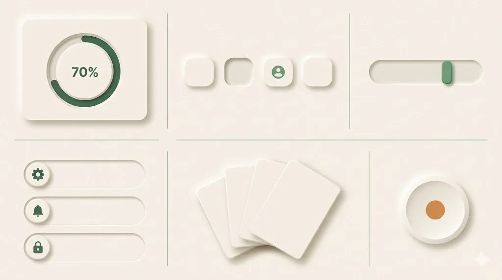
Plyuto's "Skeuomorph Mobile Banking" concept hit the front page on 1 December 2019. Within six weeks the format was named, copied, and turned into neumorphism.io, the box-shadow generator that lets non-designers produce the look in two sliders.

02 · technique

Two box-shadows, same hue.

The whole effect comes from a CSS box-shadow pair: one positive offset in a darker tint, one negative offset in white, applied to a background that matches the page colour exactly. No borders, no gradients, no transparency. Sometimes an inset version for pressed states.

The style went global because it photographs well in Dribbble shots and Figma community kits. It did not survive a single quarter of production scrutiny on most teams. The reason is the same trait that makes it photogenic: the affordance lives in subtle shadow steps that disappear on a glare-affected mobile screen, on a low-DPI monitor, and on any user whose contrast sensitivity has dropped. We will get to that in § 05.

Where neumorphism actually lives on the web.

Five real places to study the style before you ship it. None of them are full production sites, and that absence is itself part of the story. Neumorphism survives in concept galleries, generators, and Figma kits more than it survives in shipped product surfaces.

  • generator

    neumorphism.io — Adam Giebl's two-slider box-shadow generator. Pick a base colour, drag the shadow distance and intensity, copy the CSS. The cleanest single-file proof of the technique on the web.

  • archive

    dribbble.com/tags/neumorphic — the curated archive of the trend, including Alexander Plyuto's December 2019 set that named the format. Browse by date to see the look mature, peak, and quietly retire.

  • canonical article

    uxdesign.cc · "Neumorphism in user interfaces" by Michal Malewicz — the February 2020 piece that named the style and predicted its accessibility ceiling in the same paragraph. Still the most-cited reference.

  • component kits

    figma.com/community — search "neumorphism" for hundreds of UI kits, most published 2020 to 2022. Useful for studying the component vocabulary (toggles, sliders, dials) even when the broader layouts do not ship.

  • concept gallery

    behance.net — search neumorphism for the concept-art tier: fintech dashboards, music players, smart-home control panels. Most are never built; treat them as moodboards, not specifications.

One base hue, two shadows, two accents.

Neumorphism is a five-token system. A monochromatic pale base sets the surface. Two shadow tokens (one near-white, one cooler grey) handle every extrusion. Two accent hues (one purple-violet, one moss-green) are reserved for active and confirmation states only. A neutral text ink finishes the kit. The pale base #e0e5ec became the default after appearing in Plyuto's original Dribbble set.

Role Hex Swatch Where it sits
Pale base #e0e5ec Page background plus every component fill. Same hue everywhere.
Light shadow #ffffff Top-left highlight. Negative offset, soft blur.
Dark shadow #a3b1c6 Bottom-right shadow. Positive offset, slightly wider blur.
Accent · violet #6c63ff Reserved for primary action buttons and focus rings.
Accent · moss #4caf50 Confirmation toggles, success states, the "on" position.
Text ink #2c3e50 Body and label colour. The only contrast you can rely on.

Contrast check the text ink (#2c3e50) against the pale base (#e0e5ec) and you get a ratio of around 9.4:1, which is comfortable. Contrast the dark shadow (#a3b1c6) against the same base and you get 1.7:1, which is the whole accessibility problem expressed as one number. Verify your own pairings with the W3C WCAG 2.1 contrast quickref before shipping.

Geometric sans, no serifs, lots of weight.

Neumorphism asks for soft contours everywhere, including in the type. The pairing that holds the look is a geometric sans set in two or three weights with generous letter-spacing on labels. SF Pro is the Apple-native reference that started it; the production-safe Google Fonts swap is Inter; the warmer alternative used in Figma community kits is Plus Jakarta Sans. Avoid serifs and slabs entirely: they break the rendered softness.

Family Source Role Why it fits
Inter fonts.google.com/specimen/Inter Body and labels Variable, near-SF metrics, hinted for screens. The safe default.
Plus Jakarta Sans fonts.google.com/specimen/Plus+Jakarta+Sans Display / hero Slightly rounded geometric sans. Pairs well with soft shadows.
Manrope fonts.google.com/specimen/Manrope Accent / numerals Open apertures, large tabular figures. Good on dashboards and dials.

Set body at 16px / 1.55 line-height, labels at 12 to 13px with letter-spacing 0.02em uppercase, hero display at 40 to 56px with letter-spacing -0.01em. Keep type weight on the heavier side (500 to 700 body, 700 to 800 display) so labels survive when the shadow-driven contrast does not.

When neumorphism works, and when it backfires.

The style is suited to non-critical surfaces where the affordance is implied by physical context: music players, calculators, smart-home control panels, novelty B2C apps. It backfires on anything that has to pass an accessibility audit, anything used outdoors, anything aimed at older users, and anything where a missed click costs money or time. Both lists below are short and honest.

works on
  • · Music apps with hardware-style transport controls
  • · Smart-home and IoT control panels (lights, blinds, thermostats)
  • · Calculator and utility apps with obvious button affordance
  • · Decorative hero widgets on landing pages, single accent component
  • · Fintech concept dashboards where polish matters more than density
  • · Figma community kits and design-portfolio shots
  • · Single-toggle gimmicks on novelty B2C apps
backfires on
  • · Healthcare, finance, and government services (audit fines)
  • · B2B SaaS dashboards used under cognitive load
  • · Settings pages with destructive actions
  • · Anything used outdoors on a phone screen with glare
  • · Older users, low-vision users, screen-magnifier users
  • · Forms with more than four controls per screen
  • · Anything that needs to read at a glance during multitasking

The accessibility story is the one teams underestimate. Neumorphic buttons routinely fail the WCAG 2.1 success criteria 1.4.3 (contrast minimum for text) and 1.4.11 (non-text contrast for UI components). The European Accessibility Act enforces these baselines as of June 2025 across digital services in the EU; US Section 508 procurement contracts and state-level digital accessibility laws (CA, NY, WA) reference the same WCAG 2.1 AA baseline. A team that ships a neumorphic finance app in 2026 is shipping a compliance risk, not a design risk.

A starter prompt for Midjourney, Nano Banana, or v0.

Paste the block below into an image or UI generator. The prompt locks the three traits that read as neumorphic: a single pale monochromatic base, paired soft shadows on every component, and a mobile-first stack with no neon or harsh edges. Swap the bracketed product noun for your actual surface, and append one of the accent hues from § 03 if you want a confirmation state in the render.

copy · paste · ship
A [smart-home thermostat control panel] in a neumorphism UI style. Single
monochromatic pale-gray base (#e0e5ec) across the entire surface, including
the page background and every component fill. Every card, button, and toggle
is extruded with two paired soft shadows: one light highlight from the
top-left at offset (-6px, -6px) blur 16px in #ffffff, and one darker shadow
to the bottom-right at offset (6px, 6px) blur 16px in #a3b1c6. No borders, no
gradients, no transparency, no glassmorphism. A single accent hue (#6c63ff for
active, #4caf50 for confirmation) is allowed on at most one element per screen.
Typography is Inter or Plus Jakarta Sans, 16px body, 12px uppercase labels with
letter-spacing 0.02em. Mobile-first stack at 360px width, scaling to a
1440px desktop layout. Soft contours everywhere, no harsh edges, no neon, no
3D render. Focus rings and a high-contrast text colour (#2c3e50) are mandatory.

For UI generators like v0.dev or Claude Artifacts, append a CSS hint: box-shadow: -6px -6px 16px #ffffff, 6px 6px 16px #a3b1c6; background: #e0e5ec; border-radius: 16px; — the only line you need to ship the look as code. For Midjourney or Nano Banana, append --ar 9:19 --style raw on phone shots.

Five answers.

The questions we get whenever a client asks for a "neumorphic feel" on a project. Use the answers as a fit check before you commit the style to a production surface.

What is neumorphism in UI design?

Neumorphism is a soft-UI hybrid of skeuomorphism and flat design, popularised by Alexander Plyuto's December 2019 Dribbble set and Michal Malewicz's 2020 UX Design article. It is defined by a single monochromatic base colour and dual-shadow extrusions — one light highlight from the top-left and one darker shadow to the bottom-right — that make buttons, cards, and toggles appear pressed into or extruded out of the same coloured surface, never floating above it.

Is neumorphism accessible?

Often, no. The style's defining trait — extrusions made of low-contrast shadows on a monochromatic base — repeatedly fails WCAG 2.1 contrast minimums (4.5:1 for text, 3:1 for UI components against adjacent colours). Low-vision users, screen-magnifier users, and users on glare-affected mobile screens lose the affordance entirely. Treat neumorphism as a stylistic accent applied to non-critical surfaces and always pair every neumorphic control with a high-contrast focus ring, a clear label, and a keyboard-visible active state.

Neumorphism vs glassmorphism: what's different?

Glassmorphism uses translucent blur (frosted-glass cards floating above a colourful background) — depth is implied through transparency and refraction. Neumorphism uses solid extrusion (cards appear carved into or pressed out of a flat coloured surface) — depth is implied through paired shadows on a monochrome base. Glassmorphism survives accessibility audits better because text typically sits on its own opaque card; neumorphism puts the contrast burden on shadow steps that often fail WCAG.

Is neumorphism still used in 2026?

Yes, but as a stylistic accent rather than a full design language. The 2020 peak — where entire dashboards adopted the style — is gone. Today it shows up on hardware-control panels (smart-home apps, music players, calculators), on hero-section decorative widgets, on landing-page novelty components, and on Figma community kits that mostly never ship to production. Production teams use neumorphic touches inside larger flat-or-soft-3D systems, paired with high-contrast text and clear focus states.

When should I NOT use neumorphism?

Skip neumorphism on any product where the failure mode of a missed click costs money or time: dashboards used by accounting teams, healthcare apps, finance flows, government services, settings pages with destructive actions, anything aimed at older users, anything used outdoors on phone screens, and anything that needs to pass a public accessibility audit. Skip it on B2B SaaS where the design has to read at a glance during cognitively loaded work. Use it where the affordance is obvious from context (a single toggle on a music app, a calculator keypad) and where you can absorb the WCAG hit.

Want a neumorphic accent done right?

We use the style sparingly on hero widgets and hardware-style controls inside otherwise flat product UI. Book a 30-minute call and we'll review the surface you have in mind, run a WCAG check on the proposed palette, and tell you whether the look earns its keep or whether soft-3D illustration would carry the same warmth at half the audit risk.

Published .