Swiss grid web design, the 8pt grid returns.
The 1950s International Typographic Style adapted to modern screens. Strict 12-column grids, Helvetica-class sans-serif, left-alignment, hierarchy through size and weight only. A style guide for rationalist tech, museums, transit systems, and editorial publications.
- Swiss grid web design = the 1950s International Typographic Style adapted to screens. Strict 12-column grids, Helvetica-class sans-serif, left-alignment, white space as structure.
- Built by Josef Müller-Brockmann, Armin Hofmann, Max Bill, Max Miedinger (Helvetica). Codified the rules that became the modern 8pt grid + design system.
- Palette is pure white, pure black, one moderate red, two system grays, one off-spec accent. Type is Helvetica, Akzidenz-Grotesk, or Inter as the free equivalent.
- Right for rationalist tech, premium B2B SaaS, museums, transit, editorial publications. Wrong for lifestyle, heritage, family, or any brand that needs warmth.
- Accessible by construction (left-alignment, high contrast, size-and-weight hierarchy) and cheap on Core Web Vitals because Helvetica ships system-installed at near-zero cost.
The International Typographic Style on a browser.
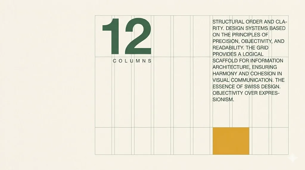
Swiss grid web design is the application of the 1950s Swiss school of graphic design to the browser. A strict 12-column mathematical grid, a single Helvetica-class sans-serif, left-aligned ragged-right body text, generous white space treated as structural rather than empty, and hierarchy expressed through size and weight only. The grid is the design; ornament is absent on purpose. The style was codified in Zurich and Basel by designers working through the 1940s and 1950s, and it remains the rationalist substrate underneath almost every modern design system.
Three names anchor the movement. Josef Müller-Brockmann wrote the book that turned the grid into a working method (Grid Systems in Graphic Design, 1981). Armin Hofmann taught at the Basel School of Design and produced the posters that defined the visual vocabulary. Max Miedinger drew Helvetica in 1957 at the Haas Type Foundry, and the typeface became so central to the movement that the words Swiss and Helvetica are now nearly interchangeable in design conversation.
On the web, the Swiss method survives in three modern artifacts. The 12-column grid that Bootstrap exposed to a generation of front-end developers is a direct port. The 8pt baseline grid that Material Design codified for software traces back to the 4pt and 8pt baseline grids of mid-century Swiss typesetting. And every Tailwind spacing scale (4, 8, 12, 16, 24, 32) is the Swiss baseline restated in CSS classes. Knowing the source is what separates an honest reference from a pastiche.
Five live sites running the grid honestly.
The Swiss approach is easier to internalise once you have seen five sites running it without apology. The references below cover the full range: newspaper of record, civic museum, heritage airline, industry-canonical typography blog, and the digital archive carrying the design-historical record of Massimo Vignelli, the New York-based designer who imported the Swiss method to American practice.
- The New York Times — the canonical specimen of rigorous editorial grid discipline on the web. Cheltenham serif for display, Franklin Gothic for utility, but the bones underneath are pure Swiss: every story column lands on a 12-column grid, every subhead lands on the same baseline. Read it after Müller-Brockmann and the borrowed method becomes obvious.
- Kunsthaus Zurich — the museum that owns one of the largest Giacometti collections in the world, set in the city that gave the movement its name. The site reads as if Müller-Brockmann himself signed off on the type hierarchy. Helvetica throughout, asymmetric grid, generous white space, image-led navigation that respects the grid.
- Lufthansa — the German airline whose mid-century corporate identity (developed by Otl Aicher and the Hochschule fur Gestaltung Ulm) is one of the earliest commercial deployments of the Swiss method. The current site has accumulated some neo-modern flourishes, but the underlying type hierarchy and crane mark trace directly back to 1962.
- idsgn (a design blog) — the typography blog that ran from 2008 onwards and remains a working primer on Swiss design conventions translated to the screen. Every post is a study in restraint: one weight, one colour for text, one accent, and a single grid running underneath.
- Massimo Vignelli's design archive — the New York Subway map, the original American Airlines identity, the Knoll posters. The archive documents the moment the Swiss method crossed the Atlantic and became American corporate practice. Anyone pitching a Swiss-style redesign should spend an hour with the Vignelli archive before opening Figma.
What none of them share: skeuomorphic gradients, drop-shadows pretending to be paper, decorative illustration in the body copy. The Swiss method is what is left after you remove every visual flourish that does not carry information.
Six swatches, including one off-spec accent.
The Swiss palette is short on purpose. Pure white as paper, pure black as ink, two neutral grays for rules and inactive states, one moderate red for accent (the Helvetica red is the canonical choice), and a single off-spec colour (a yellow or a deep blue) reserved for the one moment per page where the page wants you to notice something. Anything more than six tones reads as a brand that did not commit.
| swatch | name | hex | role |
|---|---|---|---|
| Pure white | #ffffff | paper / canvas | |
| Pure black | #000000 | ink / display type | |
| Helvetica red | #dd0000 | single accent rule | |
| System gray-500 | #6b7280 | secondary text / captions | |
| System gray-200 | #e5e7eb | rule lines / dividers | |
| Off-spec accent | #fbbf24 / #1d4ed8 | one moment per page |
The discipline that makes Swiss palettes work is committing to one accent. A second accent reads as a brand that could not pick. A third accent reads as Memphis (a different movement, different rules, different page).
One face does most of the work. Two as a maximum.
The Swiss method runs on a single Helvetica-class sans-serif handling almost every text role on the page. A monospaced face for utility (numbers, code, captions) is the only acceptable second face. Anything beyond two faces breaks the discipline and the page begins to read as a SaaS template rather than a Swiss-derived editorial system. Three options below: one paid (the real Helvetica Now or Sohne), one free (Inter), one Google-mono utility (IBM Plex Mono).
| role | typeface | weight / style | source |
|---|---|---|---|
| display + body (free) | Inter | 400 / 500 / 700 / 900 | Google Fonts |
| display + body (paid) | Helvetica Now / Akzidenz-Grotesk / Sohne | Regular 400 / Bold 700 | Linotype / Berthold / Klim Type Foundry |
| display alternate | Univers | 45 Light / 55 Roman / 65 Bold | Linotype / system in some installs |
| utility / mono | IBM Plex Mono | Regular 400 | Google Fonts |
The Inter family by Rasmus Andersson is the most-deployed free Helvetica substitute on the modern web. It is what Stripe, Figma, and most of the modern design-system community ship. If the budget for licensed Helvetica is unavailable, Inter is the honest choice.
When the Swiss grid is the right call. And when it backfires.
Swiss design is a positioning choice as much as a visual one. It works when the brand needs to read as rational, expert, and trustworthy. It actively damages brands that need to feel warm, playful, or human-scale. The Swiss grid carries an emotional temperature of measured competence, and that temperature reads as cold the moment the audience expects intimacy.
Where the Swiss grid works.
- Rationalist tech and developer tools — Stripe, Linear, Vercel marketing pages, GitHub Octoverse. The grid signals that engineers thought about the page the way they think about the product.
- Premium B2B SaaS — the buyer is a procurement committee that wants to see clarity, not personality. Swiss reads as competent and reduces the legal-and-IT review friction.
- Museums and cultural institutions — Kunsthaus Zurich, Tate Modern, MoMA. The aesthetic codes as curatorial intelligence; visitors trust the institution to know what is on the wall.
- Transit and infrastructure — Lufthansa, Swiss Federal Railways, the London Underground identity. Public-facing systems where misreading information has real-world consequences.
- Editorial publications and journalism — the New York Times, the Wall Street Journal digital edition, the Economist. The grid is what makes long-form reading bearable on a screen.
- Architecture and product design portfolios — the work itself is rationalist; the site should match.
Where the grid actively damages the brand.
- Lifestyle and heritage brands — tea companies, country clubs, vineyards, slow-fashion houses. Swiss reads as airport-terminal sterile when the brand needs to feel woven and aged.
- Childcare, family, education for young children — parents and kids both need warmth on the page. The Swiss grid signals that the institution does not care about people, which is the opposite of the message.
- Creative play, illustration-led brands, indie game studios — the page is meant to give permission for visual joy. The Swiss grid grants no such permission. Pick a different archetype (kinfolk, memphis, vaporwave).
The honest test: read the Swiss grid as a temperature reading. Cold-and-competent is the high note. If the brand sits anywhere on the warm-and-human axis, the grid will read as the wrong frequency before the visitor reads a word. See the web.dev guide on responsive layout for the technical baseline either way.
Most poorly-fit Swiss pages we audit started with a brand book that asked for a New York Times feel and ended up shipping a page that read as a corporate dashboard. The grid did not lie. The brief did.
One copy-paste prompt for v0, Midjourney, or Claude.
The prompt below is tuned for image-generation models (Midjourney, Nano Banana Pro) and code-generation models (v0.dev, Claude Artifacts). It states the constraints the Swiss method depends on: a 12-column grid, a single sans-serif, strict left-alignment, white-space majority, hierarchy through size and weight rather than colour. The hardest part of prompting for Swiss design is removing the model's default tendency to add gradients, drop-shadows, and decorative elements, so the prompt names those exclusions explicitly.
Paste the prompt into your tool of choice. The output will lean toward a neo-modern interpretation by default; if you want a more historically faithful 1960s Müller-Brockmann reference, add the line "reference Josef Müller-Brockmann's 1968 poster work and the IBM 1956 identity by Paul Rand" at the bottom of the prompt. The named-designer reference is what redirects the model toward the canonical look.
Generate a Swiss-grid web design landing page for a [BRAND NAME / ONE-LINE
DESCRIPTION] in the [RATIONALIST B2B SAAS / DEVELOPER TOOL / MUSEUM / TRANSIT
OR INFRASTRUCTURE / EDITORIAL PUBLICATION / PREMIUM ARCHITECTURE PORTFOLIO]
category.

PALETTE (strict, no other colours):
- background: pure white #ffffff
- ink and display type: pure black #000000
- secondary text and captions: system gray #6b7280
- rule lines and dividers: light gray #e5e7eb
- single accent rule or callout colour (one only, used once per viewport):
  Helvetica red #dd0000
- one off-spec moment (pick ONE per page, never two): amber yellow #fbbf24
  OR deep blue #1d4ed8

TYPOGRAPHY:
- display, body, and captions: a single Helvetica-class sans-serif
  - free option: Inter (Google Fonts), weights 400, 500, 700, 900
  - paid option: Helvetica Now, Akzidenz-Grotesk, Univers, or Sohne
- utility face for numbers and labels (optional, only acceptable second
  face): IBM Plex Mono, 400 weight
- never use a serif. Never use a script. Never use a decorative face.
- left-align all body text, ragged-right. Never justify. Never centre.
- line-height: 1.5 for body, 1.1 for display
- maximum line length: 75 characters per line

LAYOUT RULES (hard constraints):
- 12-column grid with a 24px gutter and a 64px outer margin on desktop;
  reflow to 4-column on tablet, 2-column on mobile
- every dimension is a multiple of 8 (the 8pt baseline grid). No 23.5px,
  no 17px gaps. 8, 16, 24, 32, 40, 48, 56, 64.
- white space is structural, not decorative. Half the page is meant to
  be empty.
- the grid is the design. Hierarchy is established by type size and weight
  only, never by colour or illustration.
- one hairline rule (1px, #e5e7eb) at section boundaries; no other
  decoration.
- no drop-shadows, no gradients, no rounded corners larger than 4px, no
  glassmorphism, no skeuomorphism.
- if you need an image, it sits inside the grid columns at native aspect
  ratio. No background videos.
- numerals are typographically prominent. Display a section number ("01,"
  "02") in bold at the top of each section.

DELIVERABLE: a single self-contained HTML file with inline CSS. The CSS
should use CSS Grid (12 columns) rather than Flexbox for the main layout.
No JavaScript unless the user explicitly asks for an interaction.

Do not soften the grid. Do not add visual flourish to compensate for the
restraint. The restraint is the point.
Models trained on 2023+ design data drift toward generic SaaS-template aesthetics unless explicitly constrained. The "do not soften the grid" closing line, plus the named-designer reference, is what keeps the output honest. Reference the schema.org CreativeWork vocabulary if you are also generating structured markup for the page.
Five answers.
What is Swiss design in web layout?
Swiss design in web layout is the application of the 1950s International Typographic Style to the browser. It uses a strict 12-column grid (often built on an 8pt baseline unit), a single Helvetica-class sans-serif typeface, left-alignment for body text, generous white space as a structural element rather than empty area, and hierarchy expressed through type size and weight rather than colour or decoration. The grid is the design. The mathematical relationships between text blocks, images, and rules are what carries the brand, not ornament. Adapted to screens, the Swiss approach underpins Bootstrap, Material Design's metric system, Tailwind's spacing scale, and most modern editorial sites.
What is the difference between Swiss design and Bauhaus?
Bauhaus came first (Weimar Germany, 1919 to 1933) and was concerned with unifying art, craft, and industrial production. Its design output was experimental, multidisciplinary, and embraced primary colour, geometric shape (circle, square, triangle), and the integration of typography with photography. Swiss design (Zurich and Basel, 1940s to 1960s) inherited Bauhaus principles but rationalised them into a stricter system, with the grid as the central organising element and a near-exclusive preference for sans-serif typography (Akzidenz-Grotesk, then Helvetica). The shorthand: Bauhaus is the experimental parent, Swiss design is the disciplined child who codified the rules into a working method. Most web design systems today owe more to the Swiss codification than to Bauhaus experimentation.
What is the 8pt grid system?
The 8pt grid is a spacing system where every dimension on the page (margins, padding, type sizes, line-heights, component widths) is a multiple of 8 pixels. So 8, 16, 24, 32, 40, 48, 56, 64, and so on. It was popularised in software by the early Material Design specification and Bryn Jackson's 2015 essay, but its lineage runs directly back to the 4pt and 8pt baseline grids of mid-century Swiss typesetting. The 8pt unit divides cleanly across common screen densities (1x, 1.5x, 2x), pairs naturally with the 16px browser default font size, and gives engineers and designers a shared vocabulary that produces consistent vertical rhythm without negotiation. It is the modern descendant of the Swiss baseline grid.
Why do tech companies still use Swiss design in 2026?
Three reasons. First, the Swiss approach is rationalist by construction, which signals technical authority. A site that reads like a Müller-Brockmann poster says we think clearly. Second, Helvetica is the most-installed typeface in computing history and has near-zero loading cost, which helps Core Web Vitals. Third, the strict grid produces consistent layouts across every screen size with minimal art-direction overhead, which is the cheapest scaling solution for a design system supporting 200+ surfaces. Stripe, Linear, Apple's marketing site, the New York Times, Lufthansa, and most premium B2B SaaS rely on direct descendants of the Swiss method. The aesthetic codes as trustworthy because the visual logic is verifiable on the page.
Is Swiss design accessible by default?
More so than most modern styles. Three reasons. First, left-aligned ragged-right body text is the most readable arrangement for English and other left-to-right scripts, particularly for dyslexic readers (recommended in the WCAG 2.1 guidance on text presentation). Second, the strong contrast between pure black ink and pure white paper passes WCAG AA at every text size without exception. Third, hierarchy through size and weight (rather than colour) is itself a colour-blindness accommodation. The accessibility risks worth checking are: keeping body type at 16px minimum (some Swiss-influenced editorial sites push down to 14px), using sufficient line-height (1.5 or higher for body), and keeping line length under 75 characters per line. Done thoughtfully, Swiss is one of the most accessible-by-construction styles available.

Published .