Vaporwave web design, neon retrofuturism.
The 2010-2014 internet music genre and visual aesthetic that mashed up 1980s Japanese city-pop album art, early-Windows 95 chrome, neon Miami sunsets, and ironic corporate mall imagery. A style guide for indie music labels, lo-fi brand identities, retro electronics, and art collectives.
- Vaporwave web design = the 2010-2014 internet music genre and visual aesthetic mashing 1980s Japanese city-pop, Windows 95 chrome, neon Miami sunsets and ironic corporate mall imagery.
- Vaporwave is ironic, hyper-saturated nostalgia. Synthwave is sincere 1980s homage. Same palette, different posture.
- Palette is hot magenta, electric purple, cyan, sunset gradient (purple to pink to orange), palm-silhouette black, and grid teal. Type is VT323, Press Start 2P, Audiowide.
- Right for indie music labels, lo-fi brand identities, retro electronics, art collectives, gaming nostalgia. Wrong for healthcare, finance, enterprise B2B, anything reading-heavy or trust-led.
- Carries real accessibility risk; magenta on purple frequently fails WCAG 2.1 AA contrast. Plan for it before shipping.
The 2010-2014 internet’s ironic nostalgia aesthetic.
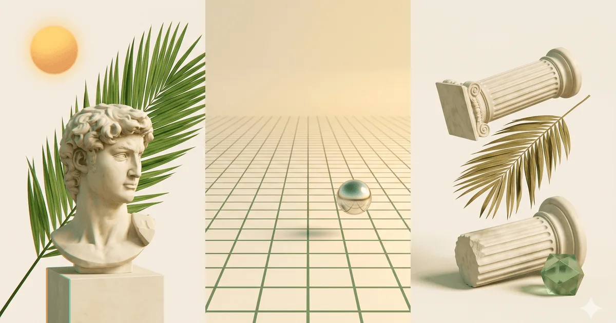
Vaporwave web design is the visual translation of an internet-native music genre that crystallised between 2010 and 2014 on Bandcamp, Last.fm and the early SoundCloud underground. Slowed and pitch-shifted 1980s Japanese city-pop, late-night corporate jingles, and Muzak mall recordings, paired with a visual lexicon built from Windows 95 chrome, Macintosh System 7 dialog boxes, palm-tree silhouettes, neon vanishing-point grids, Roman bust statues, Greek lettering, sunset gradients in magenta and cyan, and glitched VHS scanlines. The aesthetic is documented in detail across the Wikipedia entry on vaporwave as a microgenre and visual movement.
The genre’s commercial entry point was the 2011 album Floral Shoppe by Macintosh Plus, whose pink-bust cover became the de facto reference image for the entire movement. From there the style spread out of music and into broader internet culture: zines, vaporwave Tumblrs, glitch-art generators, ironic startup mockups, and eventually merch tapes, tour posters and indie game intros. The line between vaporwave-the-music and vaporwave-the-look blurred fast; by 2015 the visual style had outlived its musical novelty and started showing up on brand work for art collectives, retro electronics, and lo-fi consumer goods that wanted to read as openly nostalgic rather than pretend-2026.
What separates vaporwave from its sibling movement synthwave is intent. Vaporwave is ironic, often deliberately broken, and reads as critique of corporate 1980s capitalism. Synthwave is sincere, composed (not sampled), and reads as heroic homage to that same decade. The palette overlaps almost exactly. The posture is opposite. Knowing which one a brand is asking for is the difference between a piece that lands and a piece that reads as a costume.
Five live destinations running retrofuturism.
The fastest way to internalise vaporwave web design is to spend an hour on the sites and labels that keep the aesthetic commercially alive. The five below cover the full range — experimental net-art, indie record label, retrowave radio, curated visual archive, and the music-led web radio that introduced most listeners to the genre.
- aesthetic.computer — Jeffrey Alan Scudder’s ongoing experimental net-art and software practice. Hand-built tools, retro chrome, pixel typography, deliberate roughness. The closest contemporary inheritor of the original Macintosh System 7 vaporwave look.
- Kkamp — the active vaporwave music label on Bandcamp. Tape covers, release art, and merch all run the canonical palette: sunset gradients, palm silhouettes, Japanese katakana, neon grids. A working commercial reference for anyone pitching a music-adjacent vaporwave brand.
- the80s.fm — web radio station built around 1980s synth-pop and adjacent retrowave. Player UI runs neon grid, magenta-cyan typography, and animated CRT effects. A clean example of the look applied to a functional listening tool.
- retrowave.io — an interactive cyber-grid generator that lets visitors tweak palette and grid parameters in real time. Useful both as a reference and as a sandbox for prototyping a vaporwave background before committing to a build.
- vaporwave-archive.com — a curated archive of canonical vaporwave releases, cover art, and merch. The encyclopedia every designer pitching vaporwave eventually scrolls through. An hour spent there is the fastest way to recognise the family resemblance across the genre.
What none of them share: slick onboarding flows, premium variable fonts, calming pastel gradients, or the soft-edged template SaaS look. Vaporwave is what is left when you replace every 2026 design instinct with its 1995 equivalent.
Six colours, including a three-stop sunset.
The vaporwave palette is short, saturated, and deliberately retina-burning. Hot magenta and electric purple do most of the type work, cyan handles secondary accents and grid lines, a purple-pink-orange gradient runs the sky and background washes, palm-silhouette black anchors the foreground, and grid teal sometimes substitutes for cyan when a piece needs more green in the mix. Almost every canonical vaporwave composition is some combination of these six.
| swatch | name | hex | role |
|---|---|---|---|
| Hot magenta | #ff00ff | display type / signage | |
| Electric purple | #b300ff | mid-band of the sunset | |
| Cyan | #00ffff | grid lines / secondary type | |
| Sunset gradient | purple → pink → orange | sky wash / hero background | |
| Palm silhouette black | #0a0014 | foreground silhouettes | |
| Grid teal | #20e3b2 | alt grid / Tron-style line work |
Notice the absence of any desaturated, brand-blue, beige or warm neutral. Vaporwave uses saturated primaries plus a single gradient and one near-black. Anything in between reads as a 2026 brand trying to wear the costume.
Three faces. None of them subtle.
The vaporwave typography pairing tells you the page is openly retro before you read a word. VT323 for CRT-terminal text, Press Start 2P for arcade-game headlines, and Audiowide for synthwave-display moments. All three are free on Google Fonts, which fits the genre’s anti-commercial posture. Using a premium variable typeface defeats the irony; the whole point is that the design is openly retro, not boutique.
| role | typeface | weight / style | source |
|---|---|---|---|
| body / terminal | VT323 | Regular 400 | Google Fonts |
| display / arcade headline | Press Start 2P | Regular 400 | Google Fonts |
| synthwave display alt | Audiowide | Regular 400 | Google Fonts |
| accent / Greek-letterform | Major Mono Display | Regular 400 | Google Fonts |
The pairing rule that breaks the most pitches: never mix a humanist sans-serif into a vaporwave page. The moment a clean contemporary face appears, the page reads as synthwave-influenced 2026 brand, not the openly retro original.
When vaporwave is the right call. And when it backfires.
Vaporwave is a positioning move first and an aesthetic choice second. It works when the brand already lives inside the nostalgic-internet, music-adjacent, art-collective space — and it actively damages brands that need to read as trustworthy, warm, or accessible to a mainstream audience. Five archetypes where it lands, four where it does not.
Where vaporwave works.
- Indie music labels — the entire genre was born on Bandcamp. The aesthetic does the positioning work for free.
- Lo-fi brand identities — small consumer goods brands that want to read as openly nostalgic rather than pretend-current.
- Retro electronics and audio gear — cassette tape revivals, modular synth makers, hand-built guitar pedal shops.
- Art collectives and zines — the aesthetic carries critique-of-capitalism subtext that fits the curatorial frame.
- Gaming and esports nostalgia — retro gaming merch, arcade revivals, fan portfolios for 1980s and 1990s console eras.
- Ironic merch and meme-native brands — the visual style is already its own punchline; the brand can lean in.
Where it actively damages the brand.
- Enterprise B2B — procurement teams need to read calm authority. Magenta-on-purple reads as unserious; the deal stalls before the demo.
- Healthcare and finance — buyers need reassurance and clarity. Vaporwave signals chaos; trust collapses.
- Anything reading-heavy — long-form pages fail on Press Start 2P at small sizes and on low-contrast magenta-on-purple body. Pick a humanist sans-serif instead.
- Accessibility-critical surfaces — magenta on purple almost always fails WCAG 2.1 AA. Government, education, and any regulated surface should not ship the canonical palette.
Plan the accessibility work before the design comp. Either pull the magenta down to a darker shade for body type, restrict the canonical palette to display headlines and decorative blocks, or run every text colour pair through a WCAG 2.1 contrast checker before shipping.
The honest test: if buyers need to trust the page, vaporwave is the wrong tool. If they already share the joke, it is often the only right one.
One copy-paste prompt for Midjourney, Nano Banana or v0.
The prompt below is tuned for image-generation models (Midjourney, Nano Banana Pro) and code-generation models (v0.dev, Claude Artifacts). It states the constraints vaporwave depends on — a vanishing-point neon grid, the canonical magenta-purple-cyan palette, palm-tree silhouettes, sunset gradient sky, retro CRT body text, glitched chromatic aberration, and 1980s VHS scanlines. Strip or add the last line depending on whether you want a single landing page or a full mood-board image.
Paste the prompt into your tool of choice. Models trained on 2023+ design data will lean toward synthwave (sincere, polished, driving-Lamborghini energy) unless explicitly constrained. The closing line is what keeps the output ironic and openly retro rather than slick.
Generate a vaporwave web design landing page for a [BRAND NAME / ONE-LINE
DESCRIPTION] in the [INDIE MUSIC LABEL / LO-FI BRAND / RETRO ELECTRONICS / ART
COLLECTIVE / GAMING NOSTALGIA] category.

PALETTE (strict, no other colours):
- hero background: three-stop linear gradient at 135deg, from electric purple
  #b300ff through hot magenta #ff00ff to sunset orange #ff8a00
- display type and signage: hot magenta #ff00ff on the dark sections,
  cyan #00ffff on the gradient sections
- grid lines and wireframes: cyan #00ffff or grid teal #20e3b2
- foreground silhouettes: palm-silhouette black #0a0014 (NOT true black)
- secondary accent for arcade-style call-outs: electric purple #b300ff
- absolutely no desaturated, beige, brand-blue, or pastel colour anywhere

TYPOGRAPHY (free Google Fonts only, no premium variable faces):
- arcade display headline: Press Start 2P, regular 400, pixel-perfect, all caps
- body and small captions: VT323, regular 400, 18px minimum so the CRT pixels
  remain legible
- synthwave-display alternate for large hero words: Audiowide, regular 400
- never mix in a humanist sans-serif; the moment a clean modern face appears,
  the page stops reading as vaporwave

LAYOUT RULES (hard constraints):
- one vanishing-point neon grid receding into a sunset gradient horizon,
  centered in the hero
- two or three palm-tree silhouettes framing the foreground, abstract
  triangles, NOT photo-real palm trees
- a single moss-green serif italic word or Greek letter floating in the sky
  where a sun would be (Greek letter optional, the floating-word slot is the
  signature element)
- glitched chromatic aberration (red-cyan split) on at least one text element
- 1980s VHS scanlines as a 2-3% opacity overlay on the entire viewport
- no rounded corners on ANY UI element (border-radius: 0)
- no drop-shadows, no blur effects, no glassmorphism, no soft-edged anything
- buttons are flat rectangles with thick 3-4px neon borders, hover state is
  inverted colour, no animation

DELIVERABLE: a single self-contained HTML file with inline CSS. No JavaScript
unless the user explicitly asks for an interaction.

Lean ironic, openly retro, deliberately busy. Do NOT polish the output toward
synthwave or modern retro-futurism. Accept that the result will read as
1995 mall-aesthetic on purpose.
Models default toward sincere synthwave because that is what most 2026 retrowave training data looks like. The closing two lines are what keep the output honest. Drop them and the output drifts toward Stranger Things tribute mood-boards.
Five answers.
What is vaporwave web design?
Vaporwave web design is the visual translation of the 2010-2014 internet music genre of the same name. It assembles a deliberately recycled set of references: 1980s Japanese city-pop album covers, the chrome and pixel typography of Windows 95 and Macintosh System 7, neon vanishing-point grids borrowed from arcade game intros, sunset gradients in magenta-purple-cyan, palm-tree silhouettes, Roman bust statues, Greek lettering, glitched VHS scanlines, and chromatic aberration. The aesthetic reads as ironic corporate kitsch — a hyper-saturated nostalgia for a 1980s commercial future that never actually arrived. Distinct from synthwave, which keeps the 1980s palette but drops the irony and applies it to driving cinematic soundtracks.
What is the difference between vaporwave and synthwave?
Vaporwave is ironic; synthwave is sincere. Vaporwave samples and pitch-shifts existing 1980s pop and elevator music, layers in corporate mall imagery, and reads as a critique of late-capitalist nostalgia. Synthwave composes original instrumental tracks in the John Carpenter or Tangerine Dream tradition, treats the 1980s as a heroic setting (think Drive, Stranger Things, the Kung Fury soundtrack), and reads as straightforward genre homage. Visually, vaporwave leans on Roman busts, Japanese text, Windows 95 chrome and ironic logos; synthwave leans on driving Lamborghinis, neon mountains, and lone protagonists. The palettes overlap, the intent does not. See the Wikipedia entry on synthwave for the sibling-genre detail.
Why is vaporwave still popular in 2026?
Three reasons. First, the aesthetic carries strong nostalgic memory for the millennial and older-Gen-Z designer cohort who grew up with the original Windows 95 chrome and 1990s mall imagery — so the people making brand decisions today already feel the style. Second, it ages well on the open web because it does not pretend to be a 2026 trend; it is openly retro, so it cannot date the way 2018 gradient-mesh design did. Third, the indie music scene that birthed it on Bandcamp and SoundCloud has matured into a genuine commercial channel — labels like Kkamp keep selling vaporwave music, which keeps the visual language commercially relevant for adjacent merch, tour posters and tape covers.
Is vaporwave good for ecommerce?
Only for narrow categories. Vaporwave works for ironic merch, indie music tapes and vinyl, retro gaming accessories, lo-fi electronics, art-collective drops, and any product whose buyer is already inside the aesthetic. It fails on most other ecommerce because the deliberately busy, low-contrast magenta-on-purple compositions undermine the basic trust signals checkout flows depend on — clear pricing, readable product titles, predictable button states. If the brand is serious about scaling beyond the aesthetic-native niche, treat vaporwave as a marketing layer (campaign pages, drop announcements) and run the actual product detail pages on a calmer system.
What fonts work for a vaporwave website?
Three families do most of the work. VT323 for CRT-terminal text. Press Start 2P for 8-bit retro game headlines. Audiowide for synthwave-display headings. As a fourth optional face, Major Mono Display works for accent labels and Greek-influenced display moments. Avoid premium variable fonts and humanist sans-serifs; using a clean, contemporary face breaks the irony and pushes the page toward synthwave or generic retro-futurism.

More from Riley.
Content Strategist · APAC · Sydney · 3 posts on the site
Published .