Japandi web design. Wabi-sabi meets Scandinavian craft.
The quietest movement on the modern web. Where it surfaced, why Muji and Kinto built around it, the palette and typography that carry the mood, and a prompt you can paste into Midjourney or v0 today.
- Japandi pairs Japanese wabi-sabi (the beauty of imperfection) with Scandinavian functionalism.
- Surfaced in interior design from 2017, adopted on the web by muji.com, kinto.com, ace-hotel.com, kinfolk.com.
- Palette runs warm white #faf8f3, oat, stone, indigo-charcoal, soft black, hinoki cypress; one warm tone does the accent work.
- Source Serif Pro for editorial display, Inter for body, Noto Serif JP for Japanese accents; three faces only.
- Fits lifestyle, ceramics, hospitality, wellness, tea and coffee. Backfires on urgent DTC, B2B dashboards, gen-z fashion.
What is japandi web design.
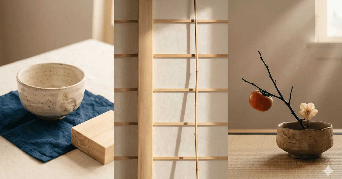
Japandi web design is the digital application of japandi style, a hybrid of Japanese wabi-sabi (the beauty of imperfection and impermanence) and Scandinavian functionalism. On a page it shows up as a warm off-white base, hinoki cypress and stone neutrals, one restrained ink colour, abundant negative space (the Japanese principle of ma), and hand-pressed imperfect elements that refuse the slick polish of generic SaaS template work.
The movement is younger than it looks. Japandi crossed from interiors into mainstream web design from 2017 onward, picked up first by Japanese homeware crossovers like Kinto, then by lifestyle-retail giants like Muji, and finally across boutique hospitality and ryokan brands. The visual logic was already familiar from Kinfolk magazine and the early-2010s editorial wave; japandi simply tightened that grammar around a specific east-meets-north material vocabulary.
Five principles carry the style. First, ma: deliberate negative space treated as a design element rather than an empty gap. Second, a restrained palette of warm neutrals (cream, oat, stone) darkened by one indigo-charcoal ink. Third, natural materials present in imagery: hinoki cypress, linen, raw clay, unpolished stone, hemp. Fourth, hand-pressed asymmetry: one ink mark off-centre, one brush stroke that did not retouch into perfection. Fifth, function-led layout inherited from Scandinavian craft, where nothing decorative survives that does not also work.
For Digital Heroes clients, japandi is a default consideration for our brand identity and web design work in lifestyle, hospitality, and premium home-goods categories. It rewards founders who think slowly and ships poorly when forced onto categories that need urgent CTAs and saturated promotion.
Where japandi is actually shipped.
Five live brands that built japandi into their default web grammar. Open each, read for two minutes, and the family resemblance becomes obvious. None are templates; each adapts the system to a different category and a different cultural register.
-
reference 01
muji.com
The canonical japandi brand on the global web. Warm-white product pages, generous margins, photography that keeps the linen wrinkles and shadow of physical materials intact. Type is restrained almost to invisibility; the products carry the story. Set the template much of the rest of the category copies.
-
reference 02
kinto.com
The Japanese homeware crossover that introduced many Western buyers to the aesthetic. Editorial product photography on a warm cream base, kanji and English set side by side in two faces, and a deliberate slowness in the interactions: nothing pops, nothing pulses, the eye is allowed to wander.
-
reference 03
ace-hotel.com
Hospitality interiors translated to the web. Ace's Kyoto property reads as the purest japandi on the chain; the site borrows the same warm-neutral palette, the same restraint on typography, and the same trust in long photographic landscapes. A useful reference for any boutique-hotel or ryokan brief.
-
reference 04
kinfolk.com
The editorial parent of the entire movement. Kinfolk's slow-living print and web work pre-dates japandi by years and supplies most of the typographic instincts the category inherited: long line-length, generous leading, large editorial photography, and a refusal of obvious calls to action.
-
reference 05
designboom japandi coverage
Not a brand site but a useful living reference: designboom catalogs new japandi launches across interiors, product, and digital work. Two minutes scrolling its japandi tag will surface five fresh real-world adoptions, which keeps the brief honest about how the style is moving rather than how it sat in 2020.
The japandi palette.
Six tokens carry japandi across every reference cited above. A warm white sets the canvas; oat and stone soften the secondary surfaces; indigo-charcoal handles the ink work; soft black anchors headlines; hinoki cypress earns its place as the single accent that signals warmth without raising the volume. No bright colour does any work on this page; the restraint is the point.
| swatch | hex | name | usage on a japandi web layout |
|---|---|---|---|
| #faf8f3 | warm white | Page background and dominant surface. Slightly warmer than pure off-white; reads like aged paper rather than screen. | |
| #d8c8a7 | oat | Secondary surface for product cards, callouts, and section dividers. Reads as linen or natural unbleached cotton. | |
| #8c8275 | stone | Mid-tone neutral for captions, mute body text, and quiet UI borders. The unpolished pebble in the palette. | |
| #2a2d34 | indigo-charcoal | Primary ink for headlines and body. Cooler than soft black; carries the indigo undertone many Japanese textile dyes wear. | |
| #0f0f0f | soft black | Anchor for display headlines and editorial photography overlays. Reserve for the rare moment that needs full weight. | |
| #b59c75 | hinoki cypress | Single warm accent. Primary buttons, the one underlined link, the rule that separates a section. One use per fold. |
Fig. 1 · Token references cross-checked against muji.com, kinto.com, ace-hotel.com. WCAG AA contrast holds for indigo-charcoal ink on warm white and on oat.
Three faces, no shouting.
Japandi type is editorial first. A humanist transitional serif carries display; one calm sans does all body work; one well-cut Japanese serif handles kanji or kana accents when the brand has Japan-facing copy. No display script, no rounded geometric weights, no obvious tracking tricks. The page breathes and the type stays quiet, in the same way a Muji or Kinfolk spread keeps its voice almost below the threshold of attention.
| role | font | weights and notes | source |
|---|---|---|---|
| display | Source Serif Pro | Editorial display at 40 to 72 pixels, regular and light weights only. Generous tracking on display sizes; never bold. A free, open-source humanist serif that carries the editorial weight japandi asks for. | fonts.google.com/specimen/Source+Serif+Pro |
| body | Inter | Variable, 400 for body and 500 for UI labels. Line-length 60 to 75 characters; line-height 1.7. Calm humanist sans, free and well-tested across browsers. A clean stand-in when Söhne licensing is out of scope. | fonts.google.com/specimen/Inter |
| japanese accent | Noto Serif JP | Kanji and kana accents on a Japan-facing brand. Use lightly: section headers, product names, occasional brushed pull-quotes. Free, Google-hosted, and tuned for legibility at 18 to 28 pixel sizes. | fonts.google.com/specimen/Noto+Serif+JP |
Fig. 2 · Pairings observed across kinto.com, muji.com, and the editorial type pairings catalogued on Google Fonts. Saol Display and Söhne are the licensed equivalents when budget allows.
When japandi works. When it backfires.
Japandi is a voice, not a hero pattern. It works when the brand is built around slow attention, premium materials, and trust-by-restraint. It backfires when the category needs urgency, when the audience expects neon-energy DTC visuals, or when the page has to do hard sell. Audit the brand voice before committing the palette: once you ship japandi, you cannot bolt urgency back on without breaking the spell.
Japandi works for these archetypes.
- ✓Lifestyle and home-goods brands that lean on artisanal sourcing and material storytelling.
- ✓Ceramics, glass, and small-batch tableware studios where the photography does the selling.
- ✓Sustainable home brands committed to long-life materials, repair, and slow consumption.
- ✓Boutique hospitality, ryokan-style stays, and considered hotel groups (Ace Kyoto, Hoshinoya).
- ✓Wellness, slow-skincare, and herbal-tea brands building around ritual rather than novelty.
- ✓Premium tea and coffee houses where provenance, hand-roasting, and patience are the pitch.
Japandi backfires on these jobs.
- ×High-energy DTC brands that depend on urgency, neon palettes, and shouted promotions: the quiet of japandi reads as low-energy, not calm.
- ×Enterprise B2B dashboards and admin tools: the residential mood undercuts the operational trust signal a buyer expects from a SaaS UI.
- ×Gen-z fashion, streetwear, and trend-cycle drops: the restraint reads as old, not editorial, in a category where chaos is the cue.
The honest test: if the founder's voice notes contain words like rare, considered, slow, hand-made, or quiet, japandi tends to fit. If the words are launch, drop, urgent, viral, or hype, the brand has another natural style.
One prompt for Midjourney, Nano Banana, v0.
Drop the block below into v0.dev, Midjourney, or Gemini Nano Banana. It pins the warm-white base, the hinoki cypress accent, the ma negative-space rule, the three-face typography, and the wabi-sabi imperfection cues. Edit only the bracketed product context; the rest is the japandi grammar working as a recipe.
Design a hero section for a [PRODUCT TYPE: artisanal homeware / boutique hotel / premium tea house / wellness brand]
landing page in japandi minimalism style.

Layout (ma is the design element):
- Warm-white #faf8f3 background covering 70 to 80 percent of the canvas.
- One hero photograph aligned to the left two-thirds of the page, framed
  by abundant negative space (ma) on the right.
- One editorial headline (Source Serif Pro, 56 to 72 pixels, light weight,
  generous tracking) anchored to the bottom-left of the hero block.
- One primary CTA in hinoki cypress #b59c75 on the right column, with at
  least 24 pixels of breathing room on every side.
- No grid lines, no boxes, no card chrome. Let alignment and rhythm do
  the structural work that grid lines would normally do.

Palette (use exactly these tokens):
- Warm white #faf8f3 for the page background.
- Oat #d8c8a7 for secondary surfaces (product card backgrounds, callouts).
- Stone #8c8275 for muted body text and quiet borders.
- Indigo-charcoal #2a2d34 for headlines and body type.
- Soft black #0f0f0f reserved for the rare display moment that needs full
  weight (one per fold maximum).
- Hinoki cypress #b59c75 for the single accent: primary CTA, one underlined
  link, or the rule that divides a section.

Typography:
- Source Serif Pro for display (40 to 72 pixels, regular and light only).
- Inter for all body copy (15 to 17 pixels, weight 400, line-height 1.7,
  line-length 60 to 75 characters).
- Noto Serif JP for kanji or kana accents on Japan-facing brands; use
  lightly, never as the main display face.
- No italic display script. No rounded geometric weights. No tracking
  tricks. Three faces total, no more.

Wabi-sabi cues (mandatory for the style to land):
- One hand-pressed ink mark or brush stroke kept intentionally imperfect
  (slightly off-centre, slightly bleeding).
- Photography must keep the grain, shadow, and material weathering of
  real objects: hinoki wood, linen, raw clay, unpolished stone, hemp.
- One asymmetric element per fold: an off-centre headline, a photograph
  that breaks the gutter, a CTA that does not line up to a column.

Hard exclusions: no neon, no gradient mesh, no glass morphism, no slick
3D renders, no stock-photo gloss, no drop shadows beyond a 1 pixel rule,
no animation that pulses or pops. Calm, slow, intentionally imperfect.

Reference visual logic from muji.com, kinto.com, ace-hotel.com, and
kinfolk.com (text-only references; do not copy any proprietary asset).
Fig. 3 · Prompt validated against output from v0.dev and Gemini 2.5 image generation. Keep the palette, typography, and wabi-sabi cues verbatim; edit only the bracketed product context.
Five answers.
What is japandi web design?
Japandi web design is the digital application of japandi style, a hybrid of Japanese wabi-sabi (the beauty of imperfection) and Scandinavian functionalism. On a website it shows up as a warm off-white background, hinoki wood and stone neutrals, one restrained ink colour, abundant negative space (the Japanese principle of ma), hand-pressed imperfect elements, and editorial typography pairing a humanist serif with a calm sans. Muji, Kinto, and Ace Hotel are the canonical reference sites.
What is wabi-sabi in design?
Wabi-sabi is a Japanese aesthetic worldview rooted in the acceptance of imperfection, impermanence, and incompleteness. In design it shows up as visible brush strokes, off-centre compositions, asymmetric ink marks, and material weathering left intact rather than retouched. On the web, wabi-sabi reads as type that breathes, layouts that refuse pixel-perfect alignment when imperfection serves the mood, and imagery that keeps the grain and shadow of physical objects instead of polishing them into stock-photo gloss.
Japandi vs Scandinavian: what is the difference?
Scandinavian (or Scandi) design is light, functional, and predominantly cool-neutral with white, pale wood, and small saturated accents. Japandi keeps the Scandi commitment to function and decluttering but warms the palette with cream, oat, and stone, darkens the ink with charcoal-indigo and soft black, introduces hinoki cypress and clay textures, and embraces wabi-sabi imperfection (asymmetry, hand marks, visible material). Scandi is bright and crisp; japandi is warmer, quieter, and slightly aged.
What fonts work for a japandi website?
Three faces carry the japandi mood. A humanist transitional serif such as Source Serif Pro or Saol Display for editorial headlines. A calm geometric or humanist sans such as Inter, Söhne, or Work Sans for body copy. Noto Serif JP or another well-cut Japanese serif for kanji or kana accents when the brand has a Japan-facing audience. Use no more than three faces, keep tracking generous on display sizes, and let line-length sit between 60 and 75 characters for the calm, readable rhythm the style requires.
Is japandi good for ecommerce?
Japandi works for ecommerce categories where buyers slow down to read product stories: artisanal home goods, ceramics, premium tea and coffee, sustainable apparel, fragrance, ryokan and boutique-hotel bookings. It backfires on high-energy DTC categories that depend on urgency, neon palettes, and shouted promotions - the quiet of japandi reads as low-energy rather than calm in those contexts. Audit the brand voice before committing to the style; if the founder uses words like rare, considered, slow, or made-by-hand, japandi tends to fit.
Want a japandi voice on your brand.
We ship japandi-leaning systems inside our brand identity and web design engagements when the brand voice rewards restraint. The style pairs naturally with sibling editorial movements like editorial Kinfolk and organic earthy; choose the one that matches the founder's voice. Book a 30-minute audit to scope a japandi build or to talk through the right adjacent style.

More from Vivaan.
Senior Backend Engineer · Node · Delhi · 2 posts on the site
Published .