Dark academia web design, oxblood on parchment.
The aesthetic of classical libraries, Oxford cloisters, and 19th-century leather-bound editions — oxblood, deep forest, candle-gold and serif typography, surfaced by Tumblr 2015-2019 and re-cemented by BookTok in 2023. A style guide for literary publishers, indie bookstores, premium menswear, and museum brands.
- Dark academia web design = oxblood + parchment + candle gold + classical serif; the aesthetic of cloisters, leather-bound editions, and reading rooms translated to a screen.
- Surfaced on Tumblr 2015-2019, gathered around Donna Tartt readers, re-cemented by BookTok 2020-2023. Commercial today on Penguin Classics, NYRB, The Paris Review, and Ralph Lauren heritage pages.
- Palette is oxblood #6c1818, deep forest #1f3a2e, parchment cream #f0e6d2, candle gold #c9a86a, ink black #14110e, mahogany #4a2c1d. Six colours, all low-saturation, all reading-warm.
- Type is classical serif: Caslon or EB Garamond display, Lora or Source Serif Pro body, Source Sans Pro for utility. No blackletter. No Times New Roman.
- Right for literary publishers, indie bookstores, premium menswear, museum archives, classical-music labels. Wrong for tech, SaaS, Gen Z DTC, and any high-scan ecommerce checkout.
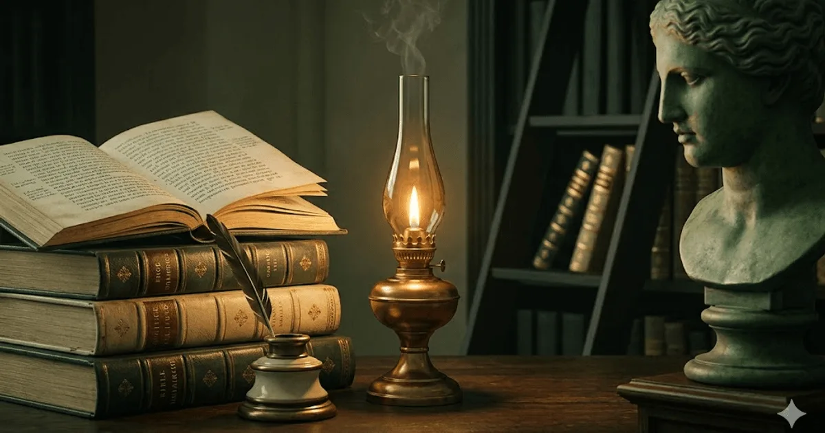
The aesthetic of cloisters, on a screen.
Dark academia web design is the digital translation of a visual subculture that took shape on Tumblr between 2015 and 2019. Oxblood and deep forest grounds, parchment cream text panels, candle-gold accents, classical serif typography, and editorial restraint borrowed from 19th-century leather-bound publishing. The mood is Oxford or Cambridge cloister at dusk, a candle-lit reading room, an antiquarian bookstore the visitor steps quietly into. The aesthetic was named and catalogued by Tumblr users in the dark academia subculture archives.
The reference text most often cited inside the subculture is Donna Tartt's 1992 novel The Secret History, set inside a small Vermont classics department and steeped in Greek tragedy, leather-bound editions, and a strain of intellectual melancholy. The book gave the visual style its narrative anchor. TikTok BookTok between 2020 and 2023 re-cemented the aesthetic for a younger readership, pairing it with classical playlists, library photography, and seasonal Pinterest boards saturated with brown leather and amber light.
By 2026 the subculture has crossed cleanly into commercial publishing and adjacent categories. Penguin Classics imprint pages, The New York Review of Books, The Paris Review online, Ralph Lauren heritage menswear, and most university-press websites all run a polished version of the same vocabulary. The grammar is simple and durable: a small low-saturation palette built around oxblood and parchment, a classical serif type system, candle-gold or brass for moments of accent, soft chiaroscuro for imagery, and reading-first layout. Done well, the result reads as quiet authority. Done poorly, it reads as a stage-set undergraduate aesthetic that has not earned its references.
Five live sites running oxblood and parchment.
The fastest way to internalise dark academia web design is to spend ten minutes on the sites that built its commercial vocabulary. The five below cover the editorial range — the university-press archive, the literary review online, the small-magazine quarterly, the heritage-menswear flagship, and the classics imprint product page. None of them call themselves dark academia; the aesthetic has matured past the label.
- Oxford Academic (Oxford University Press) — the university-press archive that anchors the visual reference. Deep blue and Oxford-stone palette, classical serif headlines, reading-first body type. The model for any scholarly publishing surface that wants to read as authoritative without theatre.
- The New York Review of Books — the literary review online; cream paper grounds, classical caslon-family serif throughout, ink-black headlines, reserved amber for editorial accents. The closest commercial parallel to the dark academia palette on a working publication.
- The Paris Review — small-magazine quarterly with a more saturated take on the palette: deep navies, parchment panels, gold dividers, classical serif throughout. Less austere than NYRB, more romantic. The reference for a magazine site that wants warmth without losing literary gravity.
- Ralph Lauren — the heritage menswear flagship. Polo-club ivy aesthetics, mahogany and oxblood, gold serif headlines, library photography. The reference for any premium-menswear or country-club category brand wanting the same warmth applied commercially.
- Penguin Classics (penguin.co.uk imprint pages) — the classics imprint product page. Black with parchment cream and Penguin-orange accent, classical serif for spine treatments, leather-bound photography. The reference for any product page where the literary heritage is the product.
What all five share: low-saturation palette, classical serif typography, generous whitespace, reading-first hierarchy, photography that uses available warm light rather than studio strobe, and a deliberate refusal of any neon, gradient, or motion ornament. Dark academia is, on the commercial side, a discipline of restraint.
Six colours, none of them bright.
Dark academia palettes are short and warm. Oxblood for ink and primary blocks, deep forest as a secondary ground, parchment cream for paper, candle-gold as the single accent, ink-black for high-contrast type, and mahogany as the warm structural neutral. Six colours, all low-saturation, all reading-warm. No neon, no pure white, no electric blue. The palette is borrowed directly from 19th-century leather-bound publishing.
| swatch | name | hex | role |
|---|---|---|---|
| Oxblood | #6c1818 | primary block / leather | |
| Deep forest | #1f3a2e | secondary ground | |
| Parchment cream | #f0e6d2 | paper / body grounds | |
| Candle gold | #c9a86a | single accent / leaf | |
| Ink black | #14110e | high-contrast type | |
| Mahogany | #4a2c1d | structural warm neutral |
Notice what is missing: pure black, pure white, electric blue, hot magenta, any neon, any gradient. Dark academia is a strictly warm palette. Cool accents are reserved for navy editorial lines on imprint pages where the publisher already has equity in a specific blue (NYRB, Penguin). Borrow the discipline; do not import the colours.
Three faces. All of them classical.
The dark academia type system is built on classical serif. A display serif descended from Caslon or Garamond for headlines, a contemporary serif tuned for screen reading at body sizes, and a humanist sans-serif for microcopy and utility surfaces. Three faces is the ceiling. Adding more reads as showmanship and breaks the editorial restraint the style depends on.
| role | typeface | weight / style | source |
|---|---|---|---|
| display | EB Garamond | Regular 400 / Italic / Bold 700 | Google Fonts |
| body | Lora | Regular 400 / Medium 500 | Google Fonts |
| utility / microcopy | Source Sans Pro | Regular 400 / SemiBold 600 | Google Fonts |
| alternates | Caslon · Garamond · Source Serif Pro · Optima | where licensable | Adobe Fonts / commercial |
What never works: blackletter (reads as gothic, not academia), Times New Roman (reads as a Word document), pure Didone faces like Bodoni or Didot (read as luxury fashion), and any rounded sans-serif (reads as 2014 SaaS). Stay inside the classical-serif family and the page reads correctly.
When dark academia is the right call. And when it backfires.
Dark academia web design is a positioning move first and an aesthetic choice second. It works when the brand needs to read as literary, scholarly, heritage, or quietly authoritative. It backfires when the brand needs to read as fast, modern, accessible, or playful. Five archetypes where it fits, four where it does not.
Where dark academia works.
- Literary publishing — university presses, classics imprints, literary reviews. The aesthetic does the positioning work for the brand.
- Independent bookstores and antiquarian dealers — rare-book sellers, used-book stores with curated stock, special-collection libraries.
- Premium menswear — heritage brands, country-club aesthetics, Ralph Lauren and its descendants. The leather-bound vocabulary translates directly to the product.
- Classical music labels and ensembles — chamber music, opera houses, conservatory websites. Pairs naturally with the discipline.
- Museum and archive sites — especially humanities collections, manuscript archives, and historical-society digital fronts. The aesthetic signals stewardship.
- Long-form writing platforms and literary newsletters — the type system supports reading at length, which most modern designs actively oppose.
Where it actively damages the brand.
- Tech and SaaS brands — oxblood serif reads as anachronistic against a modern product. The style fights everything the product communicates.
- Gen Z direct-to-consumer brands — the aesthetic reads as old-money and exclusionary, which alienates the audience and reads as cosplay if the brand cannot back it up with heritage.
- Ecommerce checkout flows — serif body type at small sizes plus low contrast plus warm palette equals lower scannability. Conversion drops measurably; the style is not worth the hit.
- Healthcare and consumer fintech — buyers need clarity and reassurance, not literary atmosphere. The style reads as opaque and slow.
Accessibility audits frequently flag oxblood text on parchment cream at small weights. Plan for it: keep serif for display only, switch body blocks over 200 words to a humanist sans-serif, and run every text-on-block pairing through a WCAG 2.1 contrast checker before shipping.
The honest test: if the brand has earned literary or scholarly heritage, dark academia is often the strongest aesthetic available. If the brand is borrowing the heritage to look more serious than it is, the style reads as theatre and the audience notices.
One copy-paste prompt for v0, Midjourney, or Claude.
The prompt below is tuned for image-generation models (Midjourney, Nano Banana Pro) and code-generation models (v0.dev, Claude Artifacts). It states the constraints dark academia depends on — oxblood and parchment palette, candle-gold leaf accents, leather-bound editorial frames, classical typography, soft candle-light shadows, and the explicit absence of neon and flat-design conventions. Strip or add the closing line depending on whether you want a single landing page or a mood-board composition.
Paste the prompt into your tool of choice. The output will lean modern by default; if you want the full library aesthetic, add the line "the result should read as a 19th-century leather-bound publication translated to a screen, not a modern reinterpretation" at the bottom of the prompt.
Generate a dark academia web design landing page for a [BRAND NAME / ONE-LINE
DESCRIPTION] in the [LITERARY PUBLISHER / INDEPENDENT BOOKSTORE / PREMIUM
MENSWEAR / CLASSICAL MUSIC LABEL / MUSEUM OR ARCHIVE / LITERARY NEWSLETTER]
category.

PALETTE (strict, no other colours):
- primary block / leather tone: oxblood #6c1818
- secondary ground: deep forest #1f3a2e
- paper / body ground: parchment cream #f0e6d2 (never pure white)
- single accent (rule lines, drop caps, gold leaf): candle gold #c9a86a
- high-contrast type: ink black #14110e (warm, never pure #000)
- structural warm neutral: mahogany #4a2c1d

TYPOGRAPHY (classical serif system, three faces maximum):
- display: EB Garamond or Caslon, italic permitted, 1-2 italic words per
  headline maximum
- body: Lora or Source Serif Pro, regular 400, 16-18px minimum, 1.7
  line-height
- utility and microcopy: Source Sans Pro or Optima, regular 400, sentence
  case
- block quotes set in italic EB Garamond, drop cap in candle gold

LAYOUT RULES (hard constraints):
- generous whitespace, reading-first hierarchy, single column or two-column
  editorial grid
- editorial frame borders in mahogany or candle gold, hairline only
- soft candle-light shadows on imagery, never hard drop shadows
- imagery rendered as if photographed with available warm light, no studio
  strobe, no flat-design illustration
- one candle-gold accent moment per viewport (drop cap, gilt rule line, or
  spine treatment)
- no neon, no gradient overlays, no glassmorphism, no flat-design icon set,
  no rounded sans-serif anywhere

MOOD AND IMAGERY:
- Oxford or Cambridge cloister at dusk, candle-lit reading room,
  leather-bound library, antiquarian bookshop, classical-music conservatory
- film-grain texture permitted at low opacity for paper-aged feeling
- chiaroscuro contrast preferred over even illumination

DELIVERABLE: a single self-contained HTML file with inline CSS. No
JavaScript unless the user explicitly asks for an interaction.

The result should read as a 19th-century leather-bound publication
translated to a screen, not a modern reinterpretation.
Models trained on 2023+ design data lean toward bright SaaS sans-serif unless explicitly constrained. The closing line is what keeps the output editorially honest.
Five answers.
What is dark academia web design?
Dark academia web design is the digital translation of the dark academia visual subculture: oxblood and deep forest backgrounds, parchment cream text panels, candle-gold accent treatments, classical serif typography (Caslon, Garamond, EB Garamond, Lora), and editorial restraint borrowed from 19th-century leather-bound publishing. It emerged on Tumblr between 2015 and 2019, gathered around Donna Tartt's The Secret History readership, and re-cemented through TikTok BookTok between 2020 and 2023. The style signals literary depth, classical education, and quiet authority. It is the visual opposite of bright SaaS sans-serif: warm, low-saturation, slow, and reading-first.
Is dark academia still on-trend in 2026?
Yes, with a shift. The peak Tumblr-era dark academia (uniforms, plaid skirts, cathedral chiaroscuro photography) has cooled. What remains popular through 2026 is the typographic and palette grammar: oxblood plus parchment plus candle gold, set in editorial serif. Penguin Classics imprint pages, The Paris Review, New York Review of Books, and Ralph Lauren heritage menswear sites all run a polished version of the same vocabulary commercially. The aesthetic crosses cleanly into adjacent territory: literary publishing, antiquarian bookstores, classical music, museum and archive sites, and premium menswear. It is no longer a Tumblr microtrend; it is a mature commercial vocabulary.
Dark academia vs gothic web design: what is the difference?
Gothic web design is darker, harder, and theatrically Victorian: pure black, blood reds, ornate ironwork iconography, and Trajan or blackletter typography. The mood is funereal or melodramatic. Dark academia is warmer, more bookish, and rooted in libraries rather than crypts. Oxblood replaces blood red; mahogany replaces pure black; parchment replaces stone. Typography is classical serif rather than blackletter. The two styles share a love of low saturation and chiaroscuro, but dark academia pairs that with candle-gold warmth and reading-first restraint. Gothic projects threat; dark academia projects scholarship.
What fonts work best for a dark academia site?
Three pairings work for almost every dark academia brief. Display: a classical serif with reading-aged glyphs (EB Garamond, Cormorant Garamond, or a licensed Caslon cut). Body: a contemporary serif tuned for screen reading (Lora, Source Serif Pro, or Garamond when sizes are large enough). Utility and microcopy: a humanist sans-serif (Source Sans Pro, Optima where licensable, or Inter at low weight). Avoid blackletter, avoid Times New Roman (reads as office document), and avoid premium Didone faces (read as luxury fashion, not academia). Test every pairing at 16px body minimum; serif body type below 16px breaks the editorial premise.
When is dark academia wrong for a brand?
Three brand archetypes that get hurt by dark academia. Tech and SaaS brands read anachronistic in oxblood serif; the style fights the product. Gen Z direct-to-consumer brands read as exclusionary and old-money, which alienates the audience. Ecommerce checkout flows lose scannability when body copy stays serif and contrast stays low; conversion drops. Two situations that demand caution rather than rejection: light-mode renderings frequently fail WCAG AA contrast on oxblood text on parchment at small weights; and dyslexic readers prefer humanist sans-serif body for long-form. Dark academia can be made accessible by keeping serif for display and switching to humanist sans-serif for any body block over 200 words.

More from Aanya.
Senior Frontend Engineer · Next.js · Delhi · 3 posts on the site
Published .