Bento grid layout. Apple's pattern, decoded.
An asymmetric tile system pulled from product launch pages and SaaS hero sections. Where it surfaced, why it stuck, the palette and type that carry it, and a prompt you can paste into v0 or Midjourney today.
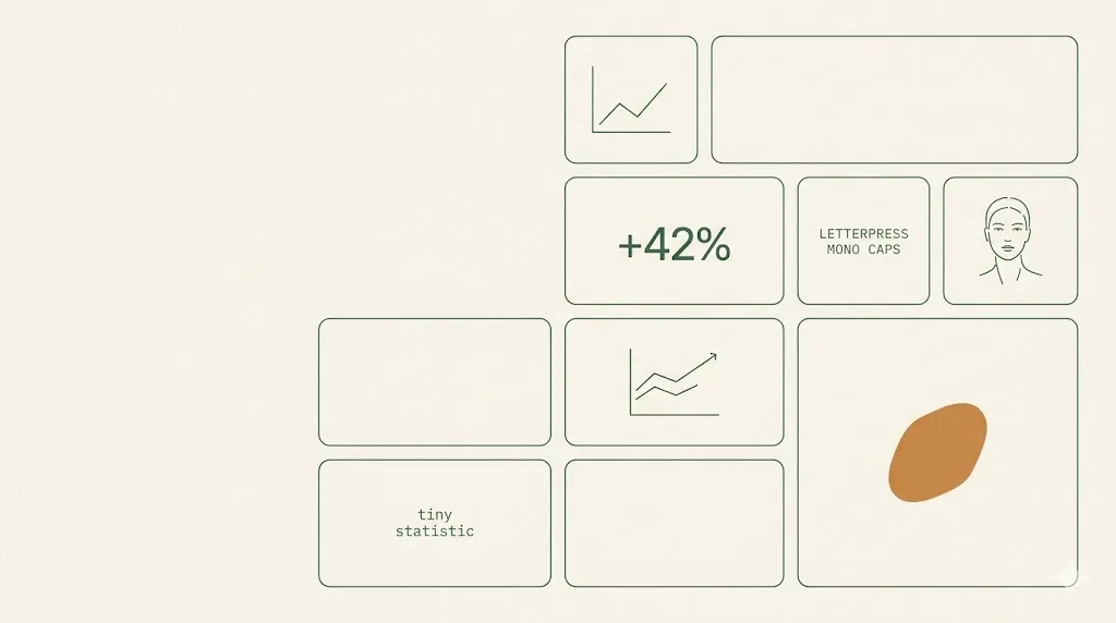
- Bento grid is an asymmetric tile pattern; one hero cell, two mid cells, four to six small cells per visible block.
- The pattern surfaced on apple.com/iphone in 2022, spread to vercel.com, linear.app, framer.com through 2023.
- Best palette runs off-white #fafafa, pastel mint, soft amber, cool gray, with one electric blue accent and jet ink.
- Inter or Geist Sans pair cleanly; SF Pro Display works on Apple-native sites, Geist Mono for caption rows.
- Plan a single-column mobile fallback from day one; CSS Grid template-areas keeps the markup unchanged across breakpoints.
What is a bento grid layout.
A bento grid layout is an asymmetric tile system inspired by Japanese lunchbox compartments. Rectangular cells of different sizes share one grid; one hero tile carries the headline, smaller tiles each hold a single feature or metric. It became a mainstream web pattern after Apple shipped it on the iPhone 14 product page in 2022.
The pattern travels well because the grammar is honest. Eight to nine product facts fit above the fold without forcing a long scroll. Each cell isolates one idea, so readers can sample in any order; the hero cell sets the narrative weight. Apple held the layout through iPhone 15, iPad Pro, Mac, and Vision Pro pages, then teams across Vercel, Linear, and Framer adapted it through 2023.
The Japanese name is literal. A traditional bento (history at Wikipedia) is a sectioned box: rice in the largest compartment, protein in the next, vegetables and pickles in smaller cells. The visual logic translates intact. The web version inherits the same restraint, the same edge geometry, and the same implicit hierarchy by area, not by colour.
For Digital Heroes clients, the bento grid is a default consideration on SaaS landing pages and product launch heroes. We use it when the content has 6 to 9 parallel facts, when the audience is technical or operator-led, and when the brand voice tolerates restraint over editorial flourish.
Where bento is actually shipped.
Five live sites that built bento grids into their default hero pattern. Visit each, read for two minutes, and the grammar becomes obvious. None of these are templates; each adapts the system to a different content shape and brand voice.
-
reference 01
apple.com/iphone
The origin reference. Each iPhone page packs nine to twelve product capabilities into a single bento block: chip, camera, battery, durability, privacy, accessibility. Hero cell carries the headline photograph; remaining cells hold a single icon and a one-line claim each. Set the visual template the rest of the industry copied.
-
reference 02
bento.me
A link-in-bio product that productized the pattern itself. Users build a personal grid from drag-and-drop tiles: photo, links, latest tweet, Spotify embed, GitHub squares. The whole tool is one bento; every user-generated profile validates the layout as both consumer-friendly and content-flexible.
-
reference 03
vercel.com
The 2023 Vercel homepage refresh anchored on a bento grid below the hero animation: edge functions, ISR, image optimization, observability, preview deployments, each in its own tile with a live mini-graphic. Vercel's adoption gave the pattern instant credibility among developer-tool teams.
-
reference 04
linear.app
Linear ships several bento sections through the marketing site: product tour, integrations, automations. Pastel tints, subtle borders, generous interior padding. Linear's tile aesthetic is the most-cloned reference on Dribbble and Twitter, partly because it photographs cleanly at any crop.
-
reference 05
framer.com
Framer uses bento blocks for product capability rollups and customer logos. The grid frequently includes one cell with an embedded animation, which sells the no-code motion editor in place. Framer's bento variant tilts a touch more playful than Apple's restraint, with rounded 24 to 32 pixel radii.
The bento palette.
Six tokens carry the bento aesthetic across every reference site cited in section 2. A near-white base sets the canvas; three soft tints (mint, amber, cool gray) tag categories without competing; one saturated accent marks interactive moments; one ink colour does all the type. Pull these hex values into your design tokens before drafting layouts.
| swatch | hex | name | usage on a bento UI |
|---|---|---|---|
| #fafafa | off-white base | Page background and inactive tile fill. Sets the calm canvas the tile borders sit against. | |
| #d9f5e8 | pastel mint | Category-one tile fill. Apple uses a similar mint on privacy and accessibility tiles; signals trust and freshness. | |
| #fff3d6 | soft amber | Category-two tile fill. Used for performance, speed, and energy claims; reads warm without shouting. | |
| #e7eaee | cool gray | Category-three tile fill. The neutral compartment for technical or operational facts; common in dev-tool grids. | |
| #2864ff | electric blue accent | Single saturated accent. Reserved for primary buttons, active links, and the one tile you want clicked first. | |
| #0a0a0c | jet ink | All headline and body type. Near-black, not pure black; reads softer at 14 to 16 pixel body sizes. |
Fig. 1 · Token references cross-checked against apple.com/iphone, vercel.com, linear.app. WCAG AA contrast verified for jet ink on every tile fill.
Three faces, no flourishes.
Bento type is intentionally quiet. One geometric grotesque carries display and body; one humanist alternate or SF Pro stands in on Apple-native sites; one monospace tags captions, metrics, and inline keyboard hints. No italic serifs, no display script, no rounded weights. The tiles do the visual work; the type stays out of the way.
| role | font | weights and notes | source |
|---|---|---|---|
| display + body | Inter | Variable, 400 for body and 600 for tile titles. Tight tracking on display sizes (-0.02em). The default on Vercel, Linear, and dozens of bento-styled SaaS sites. | fonts.google.com/specimen/Inter |
| alt body | Geist Sans | Vercel's own face, optimized for developer-tool UIs. Sharper apertures than Inter; reads particularly well at 13 to 14 pixel UI sizes. | fonts.google.com/specimen/Geist |
| apple-native | SF Pro Display | Apple platform default. Use only when the bento sits on an Apple property or a brand that explicitly leans on Apple-adjacent voice. Not free for non-Apple use. | developer.apple.com/fonts |
| caption + metric | Geist Mono | Monospace caption row, tag labels, inline keyboard shortcuts, and numerical metrics on data tiles. 11 to 12 pixel range, all-caps with 0.05em tracking on small labels. | fonts.google.com/specimen/Geist+Mono |
Fig. 2 · Pairings observed across vercel.com, linear.app, and the dev-tool bento clones charted on Google Fonts.
When bento works. When it backfires.
Bento is a hero pattern, not a whole-site system. It works when the content has 6 to 9 parallel facts of roughly equal weight. It backfires when the brand voice is editorial, when the message needs a single 60-word value statement, or when the hierarchy is sequential rather than parallel. Audit the fit before designing the tiles.
Bento works for these archetypes.
- ✓AI startups summarising 8 to 12 product capabilities above the fold.
- ✓Developer tools where each tile sells a feature primitive (edge, observability, CI, preview).
- ✓Modern SaaS landing pages targeting operators who scan, not editors who read.
- ✓Hardware and consumer-electronics product launches with 10 plus parallel specifications.
- ✓Personal portfolio or link-in-bio pages where each tile is a project, post, or social embed.
- ✓Dashboard preview sections that need to communicate breadth without a full product tour video.
Bento backfires on these jobs.
- ×Over-density: cramming 14 cells into one hero block creates visual noise and tanks tile readability.
- ×No narrative thread: bento fragments attention; case studies and storytelling pages need a reading order.
- ×Mobile collapse: designers who forget the 360 pixel fallback ship a hero that stacks into 12 awkward rows.
The honest test: if you can rewrite the section as a single paragraph with a strong topic sentence, bento is the wrong format. If you have to break it into a list of parallel claims to make sense, bento earns its place.
One prompt for Midjourney, Nano Banana, v0.
Drop the block below into v0.dev, Midjourney, or Gemini Nano Banana. It specifies the asymmetric 9-cell grid, the pastel palette from section 3, the type rules from section 4, the single hero card, and the mobile-stack fallback. Edit only the bracketed product context; the rest is the bento grammar working as a recipe.
Design a hero section for a [PRODUCT TYPE: AI SaaS / developer tool / consumer hardware]
landing page using an asymmetric 9-cell bento grid layout.

Grid:
- 3x3 desktop grid (1280px viewport), grid-gap 12px to 16px.
- One hero cell spanning 2 columns and 2 rows (top-left), carrying the headline,
  one-sentence value statement, and primary CTA.
- One secondary cell spanning 2 columns and 1 row (bottom-right), carrying a
  product screenshot or animated preview.
- Six smaller cells (1x1 each) for feature highlights, metrics, integrations,
  testimonials, or category tags.
- Each cell has 24px to 32px border-radius and 24px to 32px interior padding.

Palette (use exactly these tokens):
- Page background and inactive tiles: #fafafa (off-white).
- Pastel mint #d9f5e8 on two tiles for trust / accessibility / privacy.
- Soft amber #fff3d6 on one tile for speed / performance claim.
- Cool gray #e7eaee on two tiles for technical or neutral facts.
- Electric blue #2864ff for the primary CTA button only (one tile max).
- Jet ink #0a0a0c for all headline and body type.

Typography:
- Inter or Geist Sans for display (24 to 56px) and body (14 to 16px).
- Tight tracking on display (-0.02em); regular tracking on body.
- Geist Mono 11 to 12px, uppercase, 0.05em tracking on tile category labels.
- No italic serifs. No display script. No rounded weights.

Mobile fallback (mandatory):
- At 360 to 768px width, stack into a single column ordered by importance:
  hero, secondary, then small cells top-to-bottom.
- Maintain 24 to 32px interior padding; reduce border-radius to 20px.
- Tile height becomes content-driven; do not force equal heights on mobile.

Hard exclusions: no neon, no 3D renders, no gradient mesh backgrounds, no glass
morphism, no drop shadows beyond a 1px subtle border. Keep it flat, calm, and
photographable.

Reference visual logic from apple.com/iphone, vercel.com, and linear.app
(text-only references; do not copy any proprietary asset).
Fig. 3 · Prompt validated against output from v0.dev and Gemini 2.5 image gen. Adjust the bracketed product context, keep the grid + palette + type sections verbatim.
Five answers.
What is a bento grid layout?
A bento grid layout is an asymmetric tile system inspired by the compartments of a Japanese bento box. Rectangular cells of different sizes sit on a shared grid, where one or two large cells carry the headline message and 4 to 8 smaller cells each isolate a single feature, metric, or product fact. It surfaced widely after Apple used it on the iPhone 14 product page in 2022 and is now common across developer tools, AI startups, and SaaS landing pages.
Why did Apple start using bento layouts?
Apple needed to fit roughly 10 to 15 product facts above the fold on the iPhone 14 page without scrolling fatigue. A bento grid solved three problems at once: it broke the long scroll into scannable compartments, it let one hero cell carry brand storytelling while small cells carried specs, and it photographed well on social shares. The format scaled to iPad, Mac, Watch, and Vision Pro pages, and competitors picked it up because the visual logic was easy to copy and the conversion data was good.
When should I NOT use a bento grid?
Skip bento grids when the content has a strong reading order, when the brand voice is editorial or long-form, or when the hierarchy depends on a single 60-word value statement. Bento grids fragment attention by design. Pricing pages, legal copy, comparison tables, and case studies with narrative arcs all read worse in tiles. Bento also collapses awkwardly on mobile if the designer does not plan a single-column fallback, and it can feel generic when every cell has the same border-radius, padding, and pastel tint without intent.
How many cells should a bento grid have?
Six to nine cells is the sweet spot for a single hero section. One hero cell occupying roughly 40 to 50 percent of the area, one secondary cell at 20 to 25 percent, and 4 to 7 smaller cells filling the rest. Below six cells the grid looks under-populated and the asymmetry is wasted. Above nine the cognitive load rises sharply and small cells lose the contrast that makes the hero feel hero-sized. Apple, Vercel, and Linear all converge near eight cells per visible block.
How do I make a bento grid responsive on mobile?
Plan three stages from the start: a 3 by 3 (or 4 by 3) desktop grid, a 2-column tablet stack, and a single-column mobile flow ordered by importance. CSS Grid with grid-template-areas is the cleanest way to redefine the layout per breakpoint without rewriting the markup. Keep the hero cell at the top of the mobile flow, group related smaller cells next, and let the trailing cells stack last. Test the order at 360 pixel width, which is the canonical narrow-device benchmark Apple, Vercel, and Linear all target. The web.dev responsive design guide and the CSS-Tricks complete guide to Grid have working reference patterns.
Want a bento on your hero.
We ship bento-style heroes inside our UI and UX design and web design engagements. The pattern shows up on most SaaS development launches we build, paired with the right palette token system from our brand identity work. Book a 30-minute audit to scope a bento hero or rework an existing one that is not converting.

Published .